
How to Explain a Complex SaaS Product So Buyers Actually Get It
Most SaaS products lose potential buyers before the demo even happens. Not because the product is bad, but because the explanation is. This guide covers the 4 types of SaaS product complexity, 6 proven methods for how to explain a complex SaaS product, and a 7-step script framework that reduces the confusion most SaaS teams never solve.
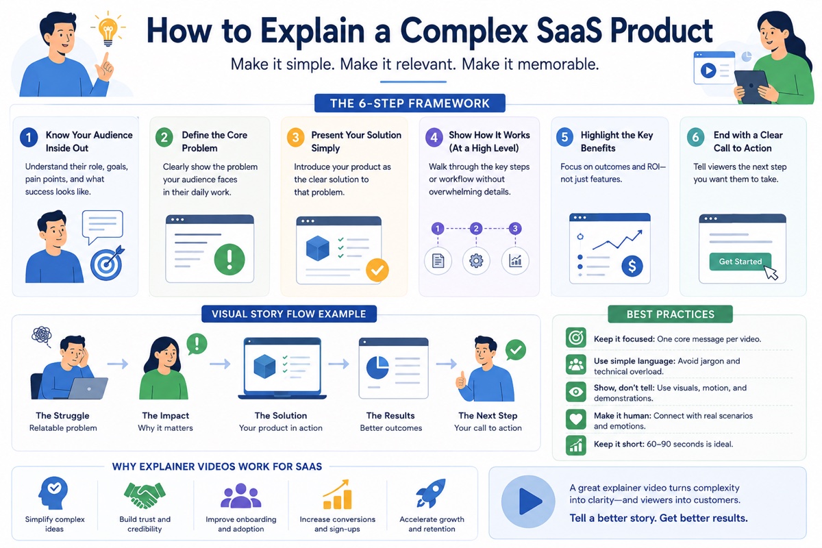 explainer video framework and strategy guide for SaaS companies" width="1136" height="638" loading="eager" />
Why Complex SaaS Products Fail to Explain Themselves
The problem is rarely the product. The problem is almost always the messaging. And messaging fails for four predictable reasons.
There is a pattern that plays out across the SaaS industry regardless of product category, price point, or team size. An engineering team builds something genuinely useful. A marketing team writes copy. A sales team runs demos. And at every stage, potential buyers nod politely, ask a few questions, and then go quiet. The pipeline stalls. The sales cycle extends. Churn happens early because customers who did convert did not fully understand what they were buying.
The root cause is almost never the product. Products that make it to market usually solve a real problem. The failure lives in the explanation. Before you can choose the right method for how to explain a complex SaaS product, it helps to understand exactly why the explanation is failing in the first place.
The Feature Trap
Engineering teams build products feature by feature, in the order that the problems are solved internally. When it comes time to write marketing copy, the team naturally describes the product in the same order: feature one, feature two, feature three. This sequence reflects how the product was built, not how a buyer evaluates it. A buyer evaluating your product has one question: will this solve my specific problem, for my specific team, at a price that makes sense? A feature list does not answer that question. It forces the buyer to reverse-engineer the value themselves, and most of them will not bother.
The Jargon Problem
Every team develops internal language. Words that mean specific things to the people who built the product, work with it daily, or have used it for years. Those words are meaningless to a buyer who discovered the product ten minutes ago. The jargon problem is particularly severe in SaaS because the product exists entirely in software, which creates its own vocabulary: pipelines, nodes, connectors, environments, schemas, webhooks. When that language appears in homepage copy or a sales deck, buyers without a technical background disengage. Buyers with a technical background still need to translate your terminology into their own framework before they can evaluate fit. Either way, the explanation creates friction before the product gets a fair hearing.
The Invisible Product Problem
Physical products can be picked up, tried on, smelled, or tasted. A software product exists entirely as an experience inside a screen. You cannot show a potential buyer the most valuable thing your SaaS product does, because the most valuable thing is usually something that happens invisibly: data flowing between systems, a compliance check running in the background, an automation triggering at the right moment, a model making a prediction. A screenshot of a dashboard shows the buyer an interface. It does not show them the value. The explanation has to do the work of making the invisible visible, which is a communication challenge that most written copy cannot solve alone.
The Multi-Persona Problem
Complex SaaS products typically have multiple buyer personas involved in the purchase decision. An IT director evaluates security and integration requirements. A CFO evaluates cost and ROI. A department head evaluates whether their team will actually use it. An end user evaluates whether it makes their specific daily tasks easier. A message that speaks to the IT director alienates the CFO. A message that speaks to the end user confuses the IT director. Most SaaS teams default to a compromise message that attempts to address all four audiences simultaneously and satisfies none of them adequately. Understanding which type of complexity your product has is the first step to choosing the right approach.
The 4 Types of SaaS Product Complexity
Not all SaaS products are complex in the same way. Identifying which type applies to your product is the first step in knowing how to explain a complex SaaS product in a way that determines which explanation method will work and which will waste your budget.
Feature-Dense Complexity
The product does many things across many use cases. The complexity is not in any individual feature but in the sheer volume of capabilities and the difficulty of choosing which one to lead with. Feature-dense products often suffer from "kitchen sink" messaging that lists everything and communicates nothing. Every feature sounds equally important because no one internally can agree on what the core value proposition is.
Examples: Salesforce, HubSpot, ClickUp, Monday.com, Notion, Asana
Process-Invisible Complexity
The value of the product happens inside systems, data flows, or backend processes that the buyer never sees during evaluation. There is nothing visible to show. A dashboard screenshot shows an interface, but the product's real value (the automation, the integration, the intelligence running underneath) is completely invisible to a camera or a screen recording. This is the complexity type where explanation fails most completely, because the tools most teams reach for (screenshots, walkthroughs, live demos) cannot show the thing that actually matters.
Examples: Zapier, data pipeline tools, API platforms, compliance SaaS, fraud detection software
Multi-Stakeholder Complexity
The purchase decision involves multiple people from different departments, each with different priorities, different levels of technical knowledge, and different definitions of success. A security platform needs sign-off from IT, finance, legal, and the CISO. An HR system needs buy-in from HR leadership, payroll, IT, and the C-suite. No single message addresses all of these stakeholders effectively, and yet most SaaS companies publish one homepage and call it done. The product is not too complex to explain; it is too complex to explain to everyone at once with the same message.
Examples: Enterprise security SaaS, ERP systems, healthcare platforms, legal tech, financial compliance tools
Category-Creating Complexity
The product creates a category that did not exist before. The buyer has no existing mental model to borrow when evaluating what the product is or why they need it. Before they can understand the solution, they must be introduced to a new problem framing they have never considered. This is the highest educational load of the four types, because the explanation must do two jobs simultaneously: make the buyer aware of a problem they have been experiencing without naming, and then show your product as the named solution to that newly-discovered problem.
Examples: Early Dropbox, early Slack, early Notion, revenue intelligence platforms, AI co-pilot tools entering new industries
6 Proven Methods to Explain a Complex SaaS Product
Each method maps to specific complexity types. The most effective teams working on how to explain a complex SaaS product use a combination, with animated explainer video as the foundation that supports every other format.
Animated Explainer Video
Best OverallAn animated explainer video is the single most versatile format for explaining a complex SaaS product because it is the only format that can make invisible processes visible. Animation can show data moving between systems, automations triggering in the background, and workflow transformations happening inside software in ways that no screen recording, live-action video, or written copy can replicate. The visual representation does the cognitive work that the buyer would otherwise have to do themselves, which is exactly why pages with video convert at 80% higher rates than text-only equivalents.
A well-produced animated explainer video for a complex SaaS product follows the 5-part conversion formula: hook on the viewer's pain, problem amplification, visual solution demonstration, one specific proof point, and one clear CTA. At 60 to 90 seconds, it delivers this entire sequence before the average viewer's attention begins to drop. The same video works on the homepage, in email outreach, as a LinkedIn organic post, as YouTube pre-roll, and inside the onboarding flow, making it the highest-ROI explanation format available.
Best for: Process-invisible and category-creating complexity. Effective across all four types.
Interactive Product Walkthrough
Best for Feature-DenseAn interactive product walkthrough lets a potential buyer navigate the product themselves, selecting the features and use cases most relevant to their specific role. For feature-dense SaaS products with many distinct use cases, this self-directed experience converts better than a guided demo, because the buyer builds their own mental model rather than following someone else's narrative. Tools like Supademo, Navattic, and Arcade allow teams to create clickable product tours without engineering resources.
The critical limitation of an interactive walkthrough is that it requires the buyer to arrive with enough context to navigate meaningfully. A buyer who does not yet understand what the product does cannot self-select the right path through it. For this reason, an interactive walkthrough almost always works better as a second step, taken after an animated explainer video has established what the product is and what problem it solves. The video earns the click; the walkthrough earns the conversion.
Best for: Feature-dense complexity, mid-funnel evaluation stage.
Jobs-to-be-Done Messaging Framework
Best for Multi-StakeholderThe Jobs-to-be-Done framework, developed by Clayton Christensen and applied extensively in product marketing, holds that buyers do not purchase products: they hire products to perform a specific job they need done. For complex SaaS products with multiple buyer personas, JTBD provides the structure for writing persona-specific messaging that all leads to the same product from different entry points. An IT director hires a security SaaS to reduce compliance exposure. A CFO hires the same product to reduce the financial risk of a data breach. A department head hires it to remove approval friction from their team's daily workflow. One product, three distinct job stories.
Applying JTBD means writing a separate "job story" for each primary persona: "When I [situation], I want to [motivation], so I can [expected outcome]." These job stories become the basis for persona-specific landing pages, email sequences, and sales deck slides. For multi-stakeholder products, this approach consistently outperforms a single generic message because each stakeholder sees their exact situation described before the product is introduced.
Best for: Multi-stakeholder complexity. Works with all types for messaging architecture.
Before / After Comparison
Best for Feature-Dense + Process-InvisibleA before/after comparison shows the buyer two distinct states: their current situation without your product, and their situation after adopting it. Unlike a feature list, which describes product capabilities, a before/after comparison describes transformation. The buyer does not need to understand how the product works to understand what life looks like with it. This is particularly effective for process-invisible products, where showing the "after" state (a team that has stopped losing files, a workflow that no longer requires manual reconciliation, a compliance dashboard that self-updates) is more convincing than any explanation of how the product achieves it.
Before/after comparisons work in multiple formats: animated video, side-by-side landing page sections, comparison tables with emotional language rather than feature language, and customer testimonials structured around the before and after. The key is using the buyer's language to describe both states, not the product team's language. "Before: 3 hours spent manually reconciling data across four spreadsheets every Monday. After: automated reconciliation runs overnight, Monday morning starts with a verified report." That structure lands. "Before: no data orchestration. After: full pipeline automation." That structure does not, because the buyer may not know what data orchestration means.
Best for: Feature-dense and process-invisible complexity.
Persona-Specific Landing Pages
Best for Multi-StakeholderPersona-specific landing pages give each buyer type their own dedicated entry point into your product's value proposition. Rather than asking a CFO to wade through technical integration documentation or asking an end user to parse ROI calculations, each persona lands on a page that speaks their language, surfaces their specific objections, and leads them to a CTA appropriate for their stage and role. For multi-stakeholder SaaS products, this approach dramatically outperforms a single homepage because it eliminates the effort the buyer has to make to find the relevant information.
The practical requirement for persona-specific landing pages is clean traffic segmentation: you need to know which persona is arriving from which source in order to route them to the right page. Paid search campaigns can be structured by persona search intent. LinkedIn ads can be targeted by job title and seniority. Referral sources from industry publications will indicate the audience type. Without segmentation, persona-specific pages are only effective if the main navigation surfaces them clearly, allowing buyers to self-select their entry point.
Best for: Multi-stakeholder complexity. High production investment; high conversion return.
Customer Story Video
Best for Category-CreatingA customer story video features a real customer explaining how they use the product, in their own words, filmed in their own workspace. It is the most credible explanation format available, precisely because it bypasses the buyer's instinct to discount brand-generated marketing. When a peer at a similar company describes the same problem the buyer has, and then explains how the product solved it, the buyer does not need to be persuaded. They identify with the character and project themselves into the outcome.
Customer story videos are particularly effective for category-creating complexity, where the buyer may be skeptical that a new category of tool can deliver what it promises. Seeing a named company with a named outcome reduces that skepticism more reliably than any statistic, case study document, or brand animation. The ideal format is two to three minutes, documentary-style, with the customer speaking to camera without a script. The most convincing customer stories are the ones that include honest friction: "It took us three weeks to set up correctly, but after that..." is more credible and more persuasive than a frictionless success narrative.
Best for: Category-creating complexity. Effective trust-builder across all complexity types.
Method vs. Complexity Type: Quick Reference
The table below maps each method for how to explain a complex SaaS product against the four complexity types, so you can choose the right format before committing budget to production.
| Method | Feature-Dense | Process-Invisible | Multi-Stakeholder | Category-Creating |
|---|---|---|---|---|
| Animated Explainer Video | Good | Best | Good | Best |
| Interactive Walkthrough | Best | Limited | Good | Limited |
| JTBD Messaging Framework | Good | Good | Best | Good |
| Before / After Comparison | Good | Best | Good | Good |
| Persona-Specific Pages | Good | Good | Best | Limited |
| Customer Story Video | Good | Good | Good | Best |
Why Animated Video Outperforms Every Other Explanation Format for Complex SaaS
Among the six methods for how to explain a complex SaaS product, animated explainer video is the only format that functions effectively at every complexity type and every funnel stage. Here is why.
It makes invisible processes visible
For process-invisible SaaS products, animation is not a style choice; it is the only viable explanation format. Animation can show data moving between systems, automations triggering in real time, and backend processes completing invisibly, in a way that no screenshot, screen recording, or written description can. When the most valuable thing your product does cannot be filmed, animation is the only medium that can show it.
It speaks to multiple personas in one video
An animated character experiencing a problem can represent an IT director, a CFO, or an end user depending on how the script frames the situation. One well-written animated explainer can address the universal pain that all three buyer personas share without requiring separate productions. This is something live-action cannot do as fluidly, because real people on camera narrow the audience's identification to a single recognisable type rather than expanding it.
It compresses multi-layered value into 90 seconds
A live product demo of a complex SaaS product takes 30 to 60 minutes and requires a sales rep, a prospect with a calendar slot, and the full attention of a buyer who may not yet be ready to commit that time. An animated explainer video delivers the same essential value proposition in 90 seconds, requires no scheduling, and works while the prospect is browsing at 11pm on a Tuesday. The compression is the conversion mechanism: the buyer understands enough to take the next step before their attention has moved on.
It works at every stage of the funnel
The same animated explainer video works on the homepage as an awareness tool, in a cold email sequence as a soft introduction, on a product landing page as a conversion aid, in a sales rep's follow-up as a leave-behind for the buying committee, and inside the onboarding flow as a context-setter for new users. No other single explanation format spans the full funnel with comparable effectiveness. This multiplier effect is why animated explainer video produces higher ROI than any individual-stage explanation tool.
According to Wyzowl's 2026 Video Marketing Report, 96% of people have watched an explainer video to learn about a product or service. For complex SaaS products specifically, video reduces the cognitive load of evaluation because the viewer does not need to hold multiple abstract concepts in their head simultaneously. The animation holds those concepts and shows their relationships visually.
Building a complex SaaS product that needs a clearer explanation?
Magic Motion Studio produces animated explainer videos for SaaS companies in 14 business days, with a complexity-first script process built in.
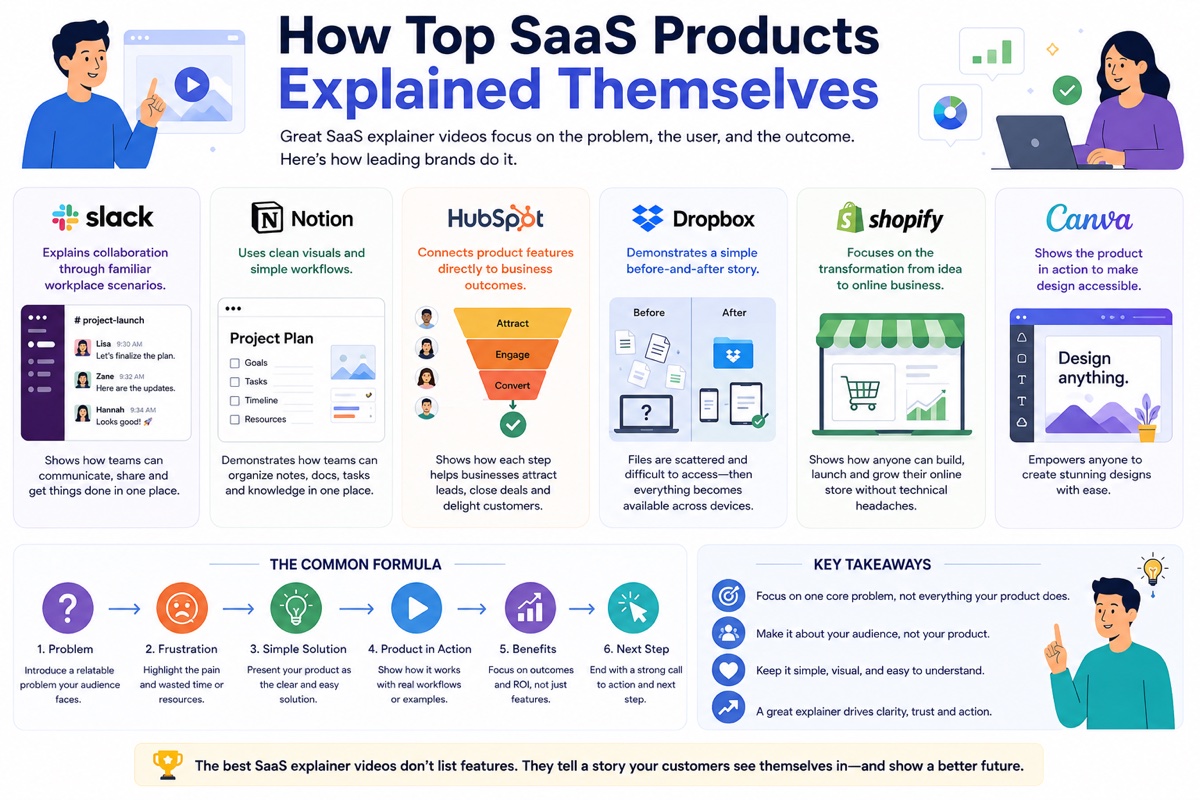
How to Write the Script for a Complex SaaS Explainer Video
The script is where most attempts to explain how to explain a complex SaaS product are won or lost. This 7-step framework is built specifically for products where the explanation has previously failed.
Most animated explainer video scripts for SaaS companies are written by copywriters who have been briefed with a feature list, a one-paragraph product description, and a request for "something simple and clear." The result is a script that describes the product in the order the brief presented it, which is usually the order of internal priority rather than buyer priority. The 7-step framework below reverses that process. It starts with the buyer and works backward to the product.
Name the universal pain: not a feature, not a stat
The first five seconds of the script must describe a frustration the buyer feels every day, in the language they use to describe it internally. Not "data management inefficiency." Not "cross-team collaboration challenges." The actual feeling: the Monday morning of scrolling through 300 unread emails. The end-of-quarter scramble to reconcile reports that all contradict each other. The meeting where no one knows which version of the document is current. Open with that. Nothing else earns the next 85 seconds.
Amplify the cost: what does staying in this pain actually cost?
The next 15 seconds make the pain feel worth solving. What does this problem cost the team in hours per week, in missed deadlines, in lost deals, in regulatory risk, in frustrated employees who eventually leave? The buyer should feel the weight of the status quo before the product appears. For complex SaaS products, this step is more important than for simpler ones because the switching cost is higher and the buyer needs to feel that the inertia of staying with the current solution is more expensive than the effort of changing it.
Introduce the product by name only: do not explain it yet
At this point in the script, introduce the product by name and by its category position: "Introducing [Product], the [category] platform that [one-line value statement]." Do not list features here. Do not explain how it works. The name and the one-line value statement are enough. The next 30 seconds will do the showing. If the script tries to explain the product in this moment, it interrupts the momentum built in steps one and two, and the viewer has to shift mental mode from feeling the problem to evaluating a solution before they have seen it work.
Show the product solving one version of the problem (animation shows what screenshots cannot)
This is the longest and most critical section. Show the product solving one specific job for one specific persona in one specific scenario. Not all jobs. Not all personas. Not all scenarios. One. For complex SaaS products, this means picking the most common job your buyers are trying to get done and building the visual demonstration around that job. Animation carries this section for process-invisible products: show data flowing between systems, show the automation running, show the result appearing in the right place at the right time. The viewer sees the product working before they read a feature description, and that sequence is what drives conversion.
Deliver one specific proof point: a name and a number, not a logo wall
A single specific proof point converts better than five general claims. "Used by over 10,000 teams" is weaker than "Acme Corp reduced their weekly reconciliation time from 6 hours to 45 minutes in the first month." The specificity is the credibility. One named company. One measurable outcome. One timeframe. The viewer does not need to evaluate the evidence; they simply need to believe that the result happened. A logo wall at this stage tells the viewer that important companies use the product. A specific outcome tells them what those important companies got from it.
State the before and after in one sentence: emotional, not technical
The contrast between life without the product and life with it should be stated in the buyer's emotional language, not in technical language. "Before: your team spends the first two hours of every Monday rebuilding the reporting that should have run automatically. After: Monday starts with a verified report waiting in the inbox." That contrast is felt before it is processed. Avoid technical before/after statements: "Before: manual API reconciliation. After: automated pipeline orchestration." That version is accurate and useless to anyone except the engineer who already knows what it means.
One CTA, calibrated to where the buyer is in their journey
A complex SaaS product homepage explainer video ends with one action: start a free trial, book a demo, or request access. The action should match the buyer's current readiness. A top-of-funnel buyer who has never heard of the product is not ready to book a 45-minute enterprise demo. They are ready to start a free trial or watch a longer product video. A mid-funnel buyer who has already evaluated two competitors is ready to book the demo. Calibrating the CTA to the buyer's readiness is one of the most consistently mishandled elements in complex SaaS video production, and it is fixable at the script stage before a single frame is animated.
5 Mistakes That Make Complex SaaS Products Even Harder to Understand
These mistakes appear across the industry regardless of company size, and each one makes it harder to learn how to explain a complex SaaS product clearly. Each one has a direct fix that can be applied before the next piece of explanation content goes live.
Opening with the company name, founding year, or mission statement
The single most common explanation mistake in SaaS is opening any video, landing page, or sales deck with "Hi, we're [Company], founded in [Year] with a mission to transform the way [industry] manages [process]." This opener prioritises the brand's story over the buyer's pain, and it arrives at exactly the moment when the buyer is deciding whether to continue engaging or click away. In a video, the first five seconds determine whether the viewer stays. In a landing page, the above-the-fold content determines whether the visitor scrolls. Company history belongs in the "About" section. Pain belongs at the top.
The feature dump: trying to explain everything at once
For feature-dense SaaS products, the temptation to mention every capability in the first explanation piece is almost irresistible internally. The product team spent 18 months building those features. The sales team gets asked about them constantly. The leadership team believes that more features equals more value equals a stronger pitch. In reality, the opposite is consistently true in buyer research: each additional feature added to a first-impression explanation reduces conversion. More features in a 90-second video means less time per feature, which means no feature is explained well enough to motivate action. The buyer leaves knowing the product has many capabilities and understanding none of them.
Using internal terminology in external messaging
Every product team develops language that is precise and meaningful within the company and meaningless outside it. Words like "orchestration," "ingestion," "provisioning," "event-driven," and "schema" have specific technical meanings. Outside the team that uses them daily, they create friction. A buyer who encounters unexplained jargon in the first 20 seconds of a video or the first paragraph of a homepage must either look up the term, guess at the meaning, or disengage. The majority choose the third option. Internal language is not more accurate or more impressive to a buyer; it is simply harder to process, and processing difficulty translates directly into reduced conversion.
Using one message for all buyer personas
For multi-stakeholder SaaS products, a single homepage message is not a neutral choice: it is a decision to speak to an average of your audiences, which in practice means speaking adequately to none of them. A message written for everyone is a message optimised for no one. The IT director reading about workflow efficiency when they are evaluating security requirements disengages. The CFO reading about technical integration architecture when they are evaluating cost reduction and risk disengages. The end user reading about compliance and enterprise scalability when they are evaluating ease of daily use disengages. The product does not change. But the story it needs to tell changes with each audience.
Choosing live-action when the product's core value is invisible
Live-action video is a strong choice for products where the value is primarily human: a service platform showing real customer interactions, a coaching SaaS featuring real coaches, a hiring tool featuring real hiring conversations. Live-action is the wrong choice for process-invisible products, because a camera can only film what is physically present. A film crew arriving at a data pipeline company will film office desks, laptop screens, and people clicking through dashboards. None of that communicates what the product actually does. The result is a polished video that leaves the viewer no closer to understanding the value than before they watched it. The production budget is spent on the wrong format.
For related reading on SaaS video strategy: see our guides on what are motion graphics, 2D animation vs motion graphics, explainer video storyboard, how long 2D animation takes to produce, SaaS explainer video production, explainer video examples that convert, startup explainer videos, what is an explainer video, 2D animation styles and which to choose, 2D animation cost guide, explainer video pricing, how to use explainer videos in a sales funnel, our explainer video production process, how to measure explainer video ROI, explainer videos for SaaS companies, how long an explainer video should be, and our comparison guide on SaaS onboarding vs explainer video for teams deciding between formats. For the research behind the Jobs-to-be-Done framework referenced in this guide, see the original work by Clayton Christensen at Harvard Business Review. For video marketing statistics cited in this guide, see Wyzowl's 2026 video marketing statistics report.
We Specialise in Animated Videos for Products That Are Hard to Explain
Every team that comes to us needing to know how to explain a complex SaaS product arrives with the same brief: "We've tried explaining this before and it hasn't worked." Our process starts with identifying the complexity type and building the script from the buyer's perspective, not the product team's.
Complexity-first discovery
Every project starts by identifying which of the 4 complexity types applies, which buyer persona to lead with, and which job to centre the script around. We do not start with the brief. We start with the buyer.
Conversion-first scripting
Our script process follows the 7-step framework in this guide. Every script opens with the buyer's pain and ends with one clear CTA matched to their funnel stage. No feature dumps. No brand intros.
Toon Boom Harmony studio
We produce in Toon Boom Harmony, the professional pipeline used by major animation studios. Rigged characters, custom illustration, and process animation that shows invisible products working visibly.
14-business-day delivery
Script, storyboard, illustration, animation, sound, and final delivery in 14 business days. We run production phases in parallel to meet the timeline without compressing quality.
All formats on delivery
Every production delivers 16:9, 1:1, and 9:16 format exports plus the original project file. One production covers your homepage, social, email, and paid ads simultaneously.
Two revision rounds included
Two structured revision rounds are built into every project at script, storyboard, and animation stages. Revision scope and timelines are confirmed in writing before production starts.
Frequently Asked Questions
Answers to the most common questions from SaaS founders and marketers on how to explain a complex SaaS product clearly and convert more buyers.
What is the most effective way to explain a complex SaaS product to a non-technical buyer?
The most effective way to explain a complex SaaS product to a non-technical buyer is to lead with the problem they already feel, not the product's technical capabilities. Non-technical buyers evaluate software by asking one question: will this make my work, or my team's work, noticeably better? An animated explainer video that opens with a recognisable pain point, shows the product solving it visually, and ends with one clear outcome answers that question in under 90 seconds without requiring any technical background. Avoid jargon, feature lists, and integration diagrams in any content aimed at non-technical stakeholders. The buyer should feel understood before they feel sold to.
How long should an explainer video be for a complex SaaS product?
60 to 90 seconds is the proven optimal length for a homepage or top-of-funnel explainer video for a complex SaaS product. This is counterintuitive because teams assume complexity requires more explanation time. In practice, the opposite is true: more time means more features, more features means more confusion, and more confusion means fewer conversions. A 90-second video forces you to pick the single most important job your product does and show it clearly. If your product genuinely requires deeper explanation, use a 90-second hero explainer for the homepage and a longer product walkthrough video of 3 to 5 minutes linked from the CTA, rather than making the homepage video longer.
What animation style works best for explaining a complex SaaS product?
2D animated motion graphics consistently perform best for complex SaaS products because they can visualise abstract processes, data flows, and workflow changes that no screen recording or live-action video can show. For process-invisible products (where the value happens inside systems the user never sees), motion graphics are the only format that can make the product's core function visible. For category-creating products, animation builds the new mental model frame by frame, allowing the viewer to follow the logic of an unfamiliar concept. At Magic Motion Studio, we produce in Toon Boom Harmony and recommend the animation style based on the specific complexity type of the product, not on aesthetic trends.
How do you explain a SaaS product that creates a new category?
Category-creating SaaS products carry the highest educational load because the buyer does not yet have a mental model for the problem the product solves. The correct sequence is: name a problem the buyer already experiences but has not named, introduce the category as the solution to that newly-named problem, then show your product as the best version of that category. Dropbox did not open by explaining cloud storage. It opened by showing a frustrated office worker losing a USB drive. Slack did not open by explaining team messaging software. It opened by showing an overloaded inbox. The category comes after the problem, and the product comes after the category. Skipping straight to the product is the most common reason category-creating SaaS companies fail to communicate their value.
What is the Jobs-to-be-Done framework and how does it help explain complex SaaS products?
The Jobs-to-be-Done (JTBD) framework, developed by Clayton Christensen, holds that buyers do not purchase products: they hire products to perform a specific job. For complex SaaS products with multiple buyer personas, JTBD provides the structure for writing persona-specific messaging that all leads to the same product from different entry points. An IT director hires a security SaaS to reduce compliance exposure. A CFO hires the same product to reduce the financial risk of a data breach. A department head hires it to remove approval friction from their team's workflow. One product, three job stories, three entry points. JTBD prevents the multi-persona messaging problem where a single generic message satisfies no buyer persona adequately.
Should I use live-action or animated video to explain a complex SaaS product?
For most complex SaaS products, animated video outperforms live-action for three specific reasons. First, animation can show invisible processes, data flows, and system integrations that live-action physically cannot film. Second, animation is easier and less expensive to update when the product changes (a script and style revision rather than a full reshoot). Third, animated characters can represent multiple buyer personas simultaneously without requiring separate productions. Live-action performs better when the product's primary value is about human relationships or in-person service experiences. The diagnostic question is simple: can a camera physically show the most important thing your product does? If not, choose animation.
How do I explain a complex SaaS product when there are multiple buyer personas?
The most effective approach for multi-stakeholder SaaS products is to lead your homepage with one universal pain that all personas share, then branch into persona-specific messaging through dedicated landing pages, persona-targeted email sequences, and a suite of short persona-specific videos. Your homepage explainer should speak to the universal pain. Your IT director page should speak to security and integration. Your CFO page should speak to cost reduction and risk. Your end-user page should speak to time saved and workflow ease. One video per persona, each under 90 seconds, consistently outperforms one long video attempting to address all audiences simultaneously. For more on this approach, see our dedicated SaaS explainer video service page and our guide to explainer videos for SaaS companies.
Ready to Explain Your Complex SaaS Product Clearly?
If you need to know how to explain a complex SaaS product in a format that converts, Magic Motion Studio produces animated explainer videos for SaaS companies in 14 business days. We start with your complexity type, build the script from your buyer's perspective, and deliver a video that works at every stage of your funnel.
Related Guides
Further reading for SaaS teams working through how to explain a complex SaaS product and build a complete video strategy:
- What Is an Explainer Video? Types, Styles and Examples
- What Is 2D Animation? Complete Guide for Businesses
- 2D Animation Studio: Character Animation & Motion Graphics
- What Are Motion Graphics? Guide for Businesses
- Explainer Videos for SaaS Companies
- SaaS Onboarding vs Explainer Video: Which Do You Need?
- Explainer Video Examples That Convert: 12 Real-World Results
- How to Measure Explainer Video ROI
- Explainer Video Cost in the USA: 2026 Pricing Guide