
Explainer Video Examples That Convert: 7 Real Videos Analysed
Not every explainer video drives results. This guide breaks down 7 real explainer video examples that convert, including Dropbox, Slack, HubSpot, Dollar Shave Club, and Intercom, using a consistent analysis framework so you can see exactly why each one works and what you can apply to your next video.
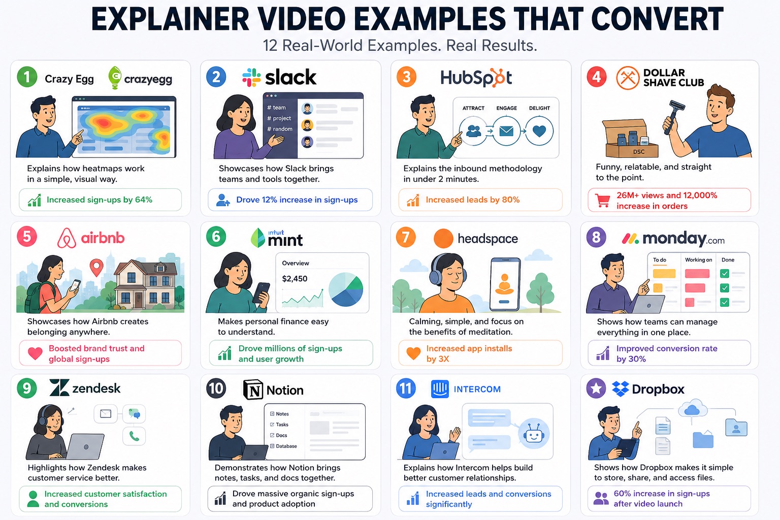
What Makes Explainer Video Examples That Convert Different
Most explainer videos describe. The ones that convert demonstrate, and they do it in a specific sequence.
There are thousands of explainer videos online. The vast majority of them fail to drive measurable action. They open with a company logo. They list product features in order of internal priority. They end with a vague invitation to "learn more." Viewers watch, nod, and move on without converting. The collection of explainer video examples that convert below demonstrates exactly what separates a video that earns a click from one that earns a scroll away.
The converting explainer videos share a fundamentally different structure. They open with the viewer's pain, not the company's name. They show the product solving a problem rather than listing what it does. They include one piece of credible proof and end with exactly one action for the viewer to take. That structure is not accidental. It is the result of testing thousands of videos across different industries, price points, and platforms.
Wyzowl's 2026 video marketing report puts the data behind this clearly: 89% of people say a video convinced them to buy a product or service, and landing pages with video convert at 80% higher rates than text-only equivalents. But those numbers apply only to videos genuinely built to convert. A poorly structured video on your homepage can actually reduce trust and increase bounce rate. Structure is everything.
The 5-Part Conversion Formula
Every explainer video example that converts follows a timing structure. Here is what that looks like in practice.
The Hook: Open with the viewer's problem
The first five seconds determine whether the viewer stays or leaves. Videos built to convert open with a sentence that names the exact pain the viewer is feeling right now, not the product name, not a statistic, not a welcome. Dropbox opened with a frustrated office worker losing an important file. Dollar Shave Club opened with the price of branded razors. Slack opened with a chaotic email chain. The hook is not clever. It is accurate.
The Problem: Amplify the cost of inaction
Once the hook lands, the best high-converting videos spend the next 15 seconds making the pain feel urgent. What does life look like if this problem is never solved? Lost files means lost work and missed deadlines. Expensive razors means money wasted every week for years. Disconnected teams means slower deals and frustrated customers. The viewer needs to feel the weight of the problem before the solution can feel like relief. This phase is proportionally short but conversion-critical.
The Solution: Show the product working, do not describe it
This is the longest section and the most commonly mishandled. Converting explainer videos show the product solving the problem in motion. They do not list features. They do not show a pricing table. They show a specific person with a specific problem using the product and getting a specific outcome. For animated videos that convert, this section uses visual storytelling: the abstract becomes concrete, the complex becomes simple, the invisible software becomes a tangible experience the viewer can picture themselves having.
The Proof: One credible result, not a list of claims
A single specific proof point converts better than five general claims. "Used by 500,000 teams" is weaker than "Sandwich Video reduced their internal email by 48% in the first week." Converting explainer videos include one proof element: a customer name and outcome, a usage statistic from a recognisable source, or a before-and-after metric that the viewer can anchor to. The proof needs to be credible enough to earn the next step. It does not need to be exhaustive.
The CTA: One action, stated clearly
Every converting explainer video ends with a single, specific call to action. Not "visit our website," not "follow us on social," not "learn more about our solutions." One clear action: start your free trial, book a demo, sign up for beta. The CTA should be low-friction relative to the stage of the funnel. A viewer watching a homepage explainer video is not ready to buy. They are ready to try or learn more. Match the CTA to where the viewer is in their decision process, and make it impossible to misunderstand.
The Conversion Scorecard
Use this framework to evaluate any explainer video against the five criteria that separate converting videos from content that gets watched and forgotten.
| Criterion | What to Look For | Score Out of 20 |
|---|---|---|
| Hook strength | Does it open with the viewer's exact pain in the first 5 seconds? No brand intro, no warmup. | 20 |
| Problem clarity | Is the cost of the problem made tangible and urgent before the product appears? | 20 |
| Solution demonstration | Is the product shown working visually, rather than described verbally? | 20 |
| Proof specificity | Is there one credible, specific proof point (a name, a number, a real outcome)? | 20 |
| CTA clarity | Is there one clear action stated at the end with no competing instructions? | 20 |
Score 80 to 100: high-converting video. Score 60 to 79: effective but leaving conversion on the table. Below 60: structural rework required before significant paid promotion.
7 Explainer Video Examples That Convert: Real Brands, Real Analysis
Each example below is scored against the conversion framework. Watch the video, then read the analysis to understand exactly which technique drove results.
Why This Is One of the Most Studied Explainer Video Examples That Convert
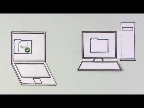
The Dropbox video was produced by Common Craft using paper cutouts and a simple camera. No motion graphics studio. No voiceover talent. No product animation. And yet it is one of the most-referenced high-converting videos in marketing history. The reason is structural, not production-based.
The video opens with a problem every office worker has experienced: you work on a file at home, email it to yourself, open it at work, make changes, email it back, and now you have two versions and no idea which is current. In the first 20 seconds, Drew Houston names a pain that millions of people feel weekly. Not a pain they need to be educated about. A pain they have been quietly suffering through.
- Hook lands in 8 seconds: "Have you ever lost a file that mattered to you?"
- Problem amplified by showing a specific scenario, not a statistic
- Solution shown working with a simple drag-and-drop demo before any feature list
- Proof built through demonstration: you see it work, you believe it works
- CTA is frictionless: join the beta, it is free
Why This Remains One of the Most Effective Explainer Video Examples That Convert
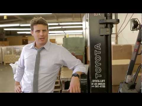
Dollar Shave Club's launch video is technically a live-action founder presentation filmed in a warehouse with a hand-held camera. It cost approximately $4,500 to produce. It generated millions in revenue and helped build a business that sold to Unilever for $1 billion five years later.
The opening line is the offer: "Hi, I'm Mike, and I'm here to talk about DollarShaveClub.com. What is DollarShaveClub.com? For a dollar a month, we send high-quality razors right to your door." In the first 10 seconds, you know the brand, the product, the price, and the delivery mechanism. There is no mystery, no suspense, no teaser. Just the offer, stated with absolute confidence.
- Opens with the offer, not the brand story (rare and effective)
- Humor eliminates the objection before it forms: you are laughing too hard to say no
- Price ("a dollar a month") is stated twice, turning cost into a punchline rather than a barrier
- 90 seconds of pure momentum: no padding, no FAQ section, no hedge
- CTA is the URL: DollarShaveClub.com. Simple enough to remember, specific enough to act on.

Why the Slack Video Redefined Explainer Video Examples That Convert for SaaS
The Slack mockumentary is not a traditional explainer video. It is a fake customer testimonial filmed in documentary style, created by Sandwich Video, a production company that was also one of Slack's early customers. That detail is critical: the video is a real customer recommending a product they actually use, filmed to look like an employee interview. The credibility is built into the format itself.
What makes this one of the most referenced high-converting examples in SaaS marketing is what it does not do. It does not show the Slack interface. It does not list channels, integrations, or pricing tiers. It shows the workflow change: people who used to miss emails, have fragmented conversations across three tools, and spend Monday mornings catching up, now have everything in one place. The product is invisible. The transformation is the story.
- Made by a real customer: the credibility comes from the format, not a claim
- Shows the problem (email chaos, missed context) through real people's reactions
- Never mentions a feature; it shows a workflow transformation instead
- Deadpan humor makes the product feel like an insider recommendation, not an ad
- Horizontal SaaS problem (team communication) shown through specific characters, not abstract diagrams
Why the HubSpot Animated Explainer Is a Benchmark for B2B Explainer Video Examples That Convert
HubSpot's animated explainer video is the strongest example in this collection of using animation to simplify complex B2B software for a multi-stakeholder audience. HubSpot is a CRM platform used by marketing, sales, and customer service teams. Explaining all three use cases without losing the viewer requires a format that can compress and visualise information quickly. Animation does this better than any other format.
The video opens with the problem of disconnected teams: marketing generating leads that sales cannot find, sales closing deals that service cannot access, service resolving issues that marketing never hears about. This is a problem that every company above 10 people has experienced. By naming the problem across three departments before showing the product, HubSpot ensures that any of three buyer personas watching the video feels understood. All three become motivated to act.
- Opens with organisational pain, not product capabilities
- Animation makes invisible software (CRM data flow) visible and comprehensible
- Addresses three buyer personas (marketing, sales, service) within a single narrative
- Visual progression shows the transformation from siloed data to unified platform
- Language stays plain throughout: no CRM jargon, no technical acronyms
Why the Intercom Whiteboard Video Is a Masterclass in Trust-Building Explainer Video Examples That Convert
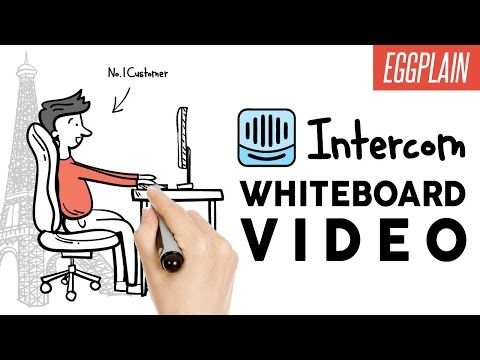
The Intercom whiteboard explainer is a different kind of converter. Where Dropbox and Dollar Shave Club convert through demonstration and confidence, Intercom converts through education and trust. The whiteboard format (hand-drawn visuals appearing in real time against a white background) carries a specific psychological signal: "we are here to teach you, not sell to you." That signal reduces sales resistance before a single product feature is mentioned.
Among the explainer video examples that convert most reliably in technical markets, the whiteboard format performs particularly well where the buyer has been burned by overpromising vendors. Customer messaging software in 2012, when Intercom launched, was a crowded category full of complex tools with steep learning curves. By adopting a teaching format, Intercom differentiated their positioning before their product was even shown. The viewer's default assumption was not "this is a sales pitch" but "this is useful information." That default assumption is worth more than any feature list.
- Whiteboard format signals education over sales, which lowers viewer resistance
- Every visual element is drawn in response to a script line: nothing decorative, everything purposeful
- Slower pacing than typical product ads, inviting comprehension rather than demanding attention
- Ends with a question ("what would that mean for your business?") that activates self-persuasion
- Self-persuasion is the most powerful form of persuasion: the viewer convinces themselves

Why Salesforce's Animated Approach Solves the Enterprise Explainer Video Challenge
Enterprise software has a specific explainer video problem: the product is used by multiple departments, evaluated by multiple stakeholders, and intimidating to everyone who has not implemented it before. Live-action enterprise videos often feel like a corporate webinar. Whiteboard videos can feel too basic for the price point. Animated 2D explainer videos thread the needle by making the product feel approachable without making it feel cheap.
The Salesforce animated explainer works because it uses character archetypes that enterprise buyers recognise immediately: the salesperson missing their quota, the manager without visibility into the pipeline, the service team working from a separate system. These are not fictional characters. They are the people in the purchase committee watching the video. When a stakeholder sees a character who looks and works like them experiencing the same problem they experience, they stop evaluating and start identifying. Identification drives conversion in enterprise explainer video examples more reliably than any feature comparison.
- Animation neutralises the intimidation factor of enterprise pricing and complexity
- Character archetypes address multiple purchase committee stakeholders simultaneously
- Integration across departments shown visually, something impossible to communicate in a feature list
- Scale communicated without showing technical complexity
- Consistent visual style reinforces brand trust at the price point enterprise buyers expect

Why the Mailchimp Video Is a Textbook Case of Job-to-Be-Done Explainer Video Examples That Convert
Mailchimp's explainer video does something that most converting SaaS explainer videos fail to do: it opens with the job the customer is trying to get done, not the product's capabilities. "You need to send emails to your customers." That sentence is not about Mailchimp. It is about the viewer's situation. By naming the job before naming the tool, Mailchimp positions the product as the obvious answer to an existing problem the viewer already has, rather than a new problem they need to be educated about.
The video then shows the product interface in motion, which serves a secondary conversion function beyond explanation. Showing the interface in a video reduces sign-up anxiety. Viewers who have never used the product and are worried it will be complicated see a simple, clean interface operating smoothly. The video simultaneously explains what the product does and demonstrates that it is easy to use. Two objections handled in under two minutes.
- Opens with the job-to-be-done ("you need to send emails"), not the product name
- Interface shown in motion reduces sign-up anxiety before the viewer ever enters the product
- Ease of use positioned as the primary value proposition: not feature count or integrations
- CTA is low-friction: "try it free" rather than "buy now" or "request a demo"
- Free trial CTA matches the risk level of a viewer who has never used email marketing software
5 Elements Every Converting Explainer Video Must Have
These are the production and structural requirements that the explainer video examples that convert in this guide all share, and that separate high-performing videos from content that gets viewed and forgotten.
A viewer-centric script (not a product-centric one)
The script of every explainer video example that converts uses more "you" and "your" language than "we" and "our." Research shows that maintaining a 1:1.5 ratio of "we/our" to "you/your" statements produces measurably higher completion rates. The script should describe the viewer's situation before describing the product. Every sentence that begins with "we" should be rewritten to begin with "you" wherever possible. Scripts that open with "We are a platform that helps teams..." convert at a fraction of the rate of scripts that open with "Your teams are spending hours on tasks that should take minutes..."
Visual demonstration, not verbal description
The visual track of an explainer video that converts shows the product doing something, not the product looking like something. Screen recordings, animated product interfaces, and character interactions with the product all show the solution working. Animated logos spinning in space, abstract backgrounds, and stock footage of people smiling at laptops describe nothing. The rule for reviewing any explainer video is simple: if you turned off the sound, would you still understand what the product does and why it matters? In the best converting explainer videos, the answer is yes.
A single, specific proof element
The proof section of a converting explainer video needs one specific, credible data point. Not a list of logos. Not a vague "thousands of customers trust us." One named customer with one specific outcome, or one verifiable usage statistic from a recognisable source. The specificity is the credibility. "Dropbox reduced file version confusion across remote teams" is a claim. "Dropbox grew from 5,000 to 75,000 beta users in 24 hours after posting their explainer video" is proof. Viewers are trained to dismiss general claims and respond to specific numbers. Give them the specific number.
90 seconds or less (with full message delivery)
Every explainer video example that converts in this collection is under 2:10. Most are under 90 seconds. This is not an aesthetic preference. It is a behavioural data point: video completion rates drop significantly after 90 seconds for non-captive audiences, and the CTA only converts if the viewer reaches it. A longer video that loses 60% of viewers before the CTA performs worse than a shorter video that retains 80% of viewers through to the action. If your product genuinely requires longer explanation, use a 90-second hero explainer on the homepage and a longer product demo video linked from it, rather than forcing everything into one video that exceeds viewer patience.
One CTA, matched to the buyer's current stage
The CTA is where the conversion happens. Every explainer video example that converts ends with exactly one action. Not "visit our website, follow us on social, and join our newsletter." One action. The action should be calibrated to the buyer's current stage: a viewer watching a top-of-funnel awareness video should be asked to start a free trial or watch a longer demo, not to book a 30-minute enterprise consultation. A viewer watching a bottom-of-funnel product demo should be asked to book a call or start a trial, not to "learn more." Matching CTA friction to buyer readiness is one of the most commonly mishandled elements in explainer video examples that are close to converting but do not quite get there.
Want an explainer video that converts like the examples above?
Magic Motion Studio builds animated explainer videos in 14 business days, with a conversion-first script process built in.
Where to Place Your Explainer Video for Maximum Conversions
The same video placed in different positions on your website or funnel produces dramatically different conversion results. Here is what the data shows for each placement.
All of the explainer video examples that convert analysed above share one more trait beyond structure: strategic placement. The video was where the buyer already was in their decision journey. Production and script get the viewer to act. Placement determines whether the right viewer sees the video at all.
Homepage (Above the Fold)
The highest-value placement for converting explainer videos. A homepage video answers the visitor's first question ("what does this company do and why should I care?") before they scroll away. Autoplay muted video or a prominent thumbnail with play button both perform well. Ensure the video loads within 3 seconds or the placement works against you.
Product and Pricing Pages
Bottom-of-funnel placement where the viewer is actively evaluating. An explainer video that addresses the most common objections at this stage converts visitors who would otherwise leave to compare competitors. The video at this placement should be shorter (60 to 75 seconds) and focused specifically on the evaluation question the visitor is trying to answer.
Email Campaigns
Adding a video thumbnail to a cold outreach or nurture email and writing the subject line as "Video: [topic]" increases open rates by an average of 19% and click-through rates by 96% compared to text-only emails. Link the thumbnail to your landing page with the explainer video embedded above the fold. The email drives the click; the video drives the conversion.
Paid Video Ads (YouTube and Social)
Converting explainer videos on paid channels front-load the hook into the first 5 seconds, before the viewer has the option to skip. The first 5 seconds must contain the problem or the offer, not a logo reveal or brand introduction. For YouTube pre-roll, the goal of the first 5 seconds is to earn the next 85 seconds. For social feed video, sound-off design is critical: captions and on-screen text must carry the message without audio.
Sales Outreach and Follow-Up
Sharing a relevant explainer video in a sales follow-up sequence gives the prospect something to forward to other stakeholders in their organisation. Enterprise purchase decisions involve multiple people. An explainer video that a salesperson can share with a champion who can share it with their manager and procurement team multiplies the sales conversation without requiring additional sales time. For this use case, high-performing videos are under 90 seconds and address a single department's specific pain.
5 Mistakes That Kill Explainer Video Conversions
These are the most common reasons videos fail to reach the standard set by explainer video examples that convert. Study each one and apply the fix before your next production.
Opening with the company name and founding story
The most common conversion killer in explainer videos is opening with "Hi, we are [Company], founded in [Year] with a mission to..." Viewers make their stay-or-leave decision in the first 5 seconds. An opening that prioritises company history over viewer pain loses most of its audience before the product appears. None of the converting videos in this collection open with a brand introduction. Every one of them opens with the viewer's problem or the offer.
Listing features instead of showing transformation
A video that spends 60 seconds listing product features in order of engineering priority is describing a product, not selling one. Features are what the product has. Transformation is what the viewer's life looks like after using it. The best converting explainer videos spend the majority of their runtime showing the viewer's situation improving: the team that was chaotic becomes coordinated, the founder who was spending $20 a month on razors is now spending $1, the employee who was losing files never loses one again.
Using generic stock visuals that show nothing
Stock footage of people smiling at laptops, abstract geometric animations, and spinning globe graphics are visual filler. They signal to the viewer that the company either could not afford real production or did not care enough to create visuals specific to the product. In animated videos that convert, every visual element is earned by a script line. If the script says "your files sync automatically," the animation shows files syncing. Nothing decorative. Nothing generic. Every frame advances the argument.
Including multiple calls to action
A video that ends with "visit our website, follow us on LinkedIn, download our guide, or book a free call" produces conversions at the rate of none of those actions. When a viewer is given multiple options, the cognitive load of choosing between them produces the same outcome as no CTA at all: they close the tab. Every converting video in this collection ends with one action. Dropbox: join the beta. Dollar Shave Club: go to DollarShaveClub.com. Slack: the video ends, the signup page is already open. One action. One conversion event.
Producing a great video and placing it where no one sees it
The most avoidable conversion failure is placing a well-produced explainer video on a page with low traffic, no above-fold positioning, or buried behind three clicks from the homepage. Converting explainer videos are placed where the buyer already is in their decision journey: above the fold on the homepage, on the product page during evaluation, in the email follow-up after a demo, and in the paid ad creative for top-of-funnel acquisition. Placement multiplies production investment. A video that no one sees converts no one, regardless of its quality.
Animated Explainer Video Examples That Convert, Delivered in 14 Business Days
The explainer video examples that convert featured in this guide were each built around a specific conversion goal, a specific audience, and one clear call to action. That is exactly how Magic Motion Studio approaches every production.
Conversion-first scripting
Our script process follows the 5-part conversion formula. Every script opens with the viewer's pain and ends with one clear CTA. We do not start with feature lists.
14-business-day delivery
We run illustration, animation, and sound in parallel. Our standard turnaround is 14 business days from approved script to final delivery, without compromising quality.
Toon Boom Harmony studio
We produce in Toon Boom Harmony, the same professional pipeline used by major studios. Rigged characters, asset libraries, and export for every format including vertical social cuts.
Style matched to your funnel stage
We recommend the animation style, length, and placement strategy based on where the video sits in your conversion funnel, not on what is trending in the industry.
Two revision rounds included
Two rounds of revisions are built into every production at script, storyboard, and animation stages. Revision scope and timelines are agreed in writing before production starts.
All formats on delivery
Final delivery includes 16:9, 1:1, and 9:16 formats plus the original project file. One production covers your homepage, social channels, email campaigns, and paid ads simultaneously.
The explainer video examples that convert above represent a selection from a much broader library of strategy content on the Magic Motion Studio blog. For further reading on structure, style, cost, and placement: see our guides on SaaS explainer video production, startup explainer videos, what is an explainer video, what are motion graphics, how to explain a complex SaaS product, our explainer video production process, 2D animation cost guide, how long 2D animation takes to produce, explainer videos for SaaS companies, SaaS onboarding vs explainer video, how to use explainer videos in a sales funnel, how to measure explainer video ROI, explainer video storyboard guide, explainer video pricing, 2D animation vs motion graphics, and how long an explainer video should be.
Frequently Asked Questions
Answers to the most common questions about converting explainer videos and what makes them work.
What makes explainer video examples that convert different from regular explainer videos?
Explainer video examples that convert are built around the viewer's problem, not the product's features. They open with a pain point the viewer already feels, demonstrate the solution in action, include one piece of credible proof, and end with a single clear call to action. Generic explainer videos list product features in order of company priority. Converting explainer videos lead with viewer priority: the pain, the cost of staying in pain, and the relief of solving it. The 5-part conversion formula (Hook, Problem, Solution, Proof, CTA) is the structural difference between the two types.
How long should a converting explainer video be?
60 to 90 seconds is the proven optimal length for a conversion-focused explainer video. At 90 seconds, average viewer completion rates are around 59%, which is high enough to deliver the full message and CTA. Videos under 60 seconds often cannot include enough proof to warrant a conversion decision. Videos over 2 minutes lose the majority of viewers before the CTA. If your product genuinely requires more explanation, use a 90-second hero explainer on the homepage and link to a longer product demo from the CTA. All of the best converting videos in this guide are under 2 minutes 10 seconds, and most are under 90 seconds.
Which style of explainer video converts best for SaaS companies?
Animated 2D explainer videos consistently produce the highest conversion rates for SaaS products on homepage and product landing pages. Animation makes abstract software workflows visual, simplifies complex integrations into comprehensible sequences, and works across devices without aging. For horizontal SaaS tools where the transformation in team behaviour is the core value proposition, a live-action mockumentary approach (as Slack demonstrated) works exceptionally well because it relies on peer validation rather than feature demonstration. The right style depends on your product complexity, your buyer's sophistication, and where in your funnel the video will be placed. See our 2D animation styles guide for a full breakdown by use case.
What is the 5-part conversion formula for explainer videos?
The 5-part conversion formula used in all high-performing explainer video examples that convert is: Hook (0 to 5 seconds, name the viewer's exact pain point), Problem (5 to 20 seconds, amplify the cost of staying in that pain), Solution (20 to 55 seconds, show the product solving the problem visually), Proof (55 to 75 seconds, one specific credible result or social proof element), and CTA (75 to 90 seconds, one clear action for the viewer to take). This structure is not a creative template. It is a conversion framework derived from analysing thousands of videos across industries and measuring their performance against a common benchmark.
Where should I place an explainer video to maximise conversions?
Homepage placement above the fold produces the highest overall conversion lift, typically 20 to 80% depending on the product and traffic quality. Product and pricing pages are the second priority, where high-performing videos in this format reduce objections and increase trial sign-ups from visitors who are actively evaluating. Email campaigns that include a video thumbnail see an average 96% higher click-through rate than text-only emails. For paid acquisition, explainer videos used as YouTube pre-roll and social video ads consistently outperform static image ads for complex products because they can communicate a multi-step value proposition in a format that holds attention.
What is the most common mistake that kills explainer video conversions?
Opening with the company name and founding year rather than the viewer's problem is the single most common conversion killer. Viewers decide in the first 5 seconds whether to keep watching. A script that opens with "Hi, we are Company X, founded in 2018 with a mission to transform the way businesses manage their workflows..." loses most of its audience before the product is shown. Every explainer video example that converts in this guide opens with the viewer's problem or the offer, not the brand story. The fix is simple: rewrite the opening line to describe the viewer's exact pain point in their own language. Save the company name for the CTA.
How much does an explainer video that converts cost to produce?
Production investment for a converting explainer video varies by style and studio. Animated 2D explainer videos from professional studios typically range from $3,000 for flat design motion graphics to $10,000 and above for custom character animation with full illustration. Whiteboard animation sits in the $2,000 to $5,000 range. Live-action productions add talent, location, and post-production costs to those figures. At Magic Motion Studio, we produce animated explainer videos in 14 business days. For current investment details by style and video length, see our 2D animation cost guide.
Ready to Build an Explainer Video That Actually Converts?
Magic Motion Studio produces animated explainer videos in 14 business days, with a conversion-first script process, professional 2D animation, and all delivery formats included.
Related Guides
- 2D Animation Studio: Character Animation & Motion Graphics
- What Is an Explainer Video? Types, Styles and Examples
- What Is 2D Animation? Complete Guide for Businesses
- 2D Animation Styles: Flat Design, Frame-by-Frame, Cutout and More
- What Are Motion Graphics? Guide for Businesses
- Explainer Video Cost in the USA: 2026 Pricing Guide
- Explainer Video Cost in Australia: Full Pricing Breakdown
- Best Explainer Video Companies in Australia