
Explainer Videos for SaaS Companies: The Complete Guide (2026)
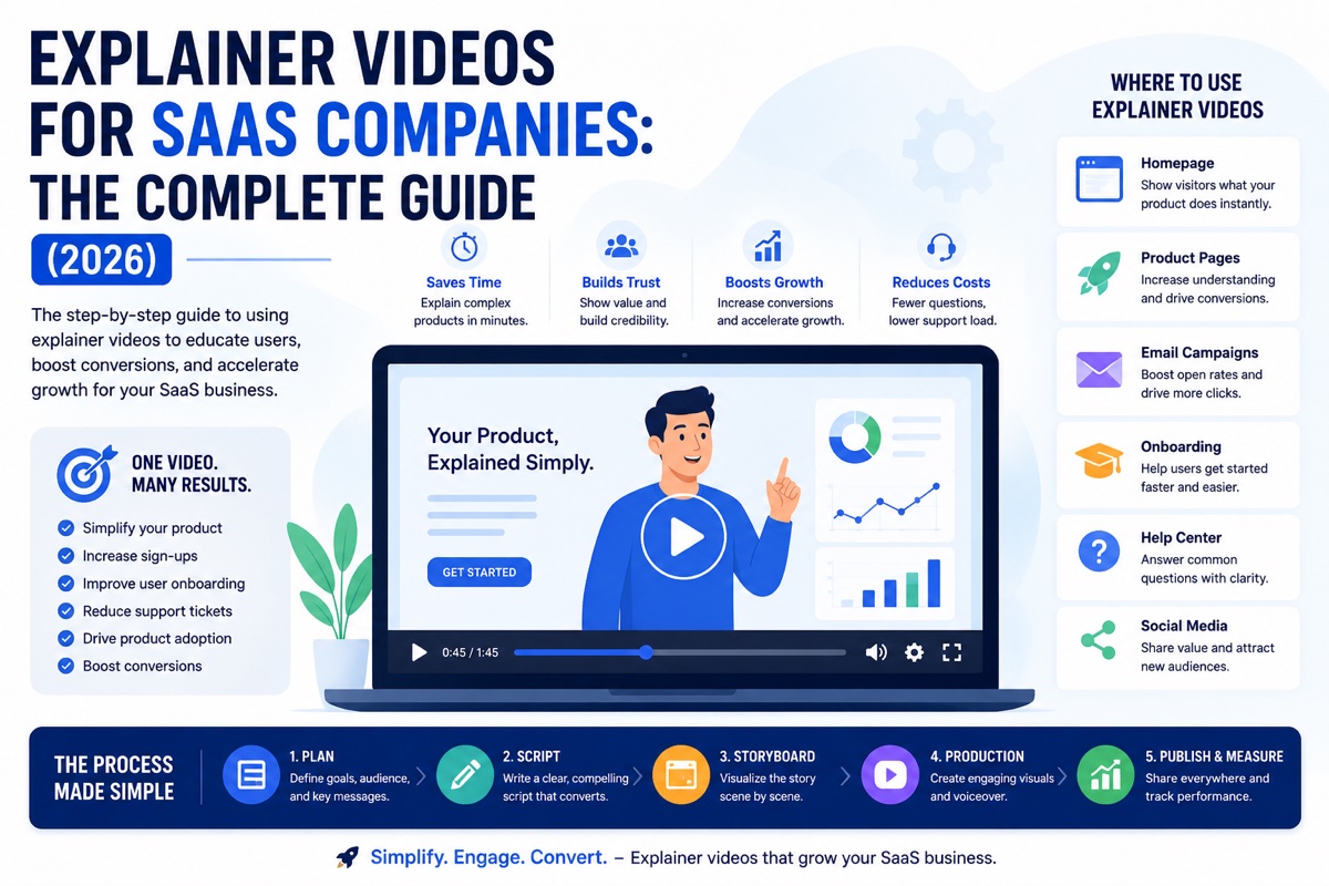
Explainer videos for SaaS companies work because software has no physical form, so the product has to be explained rather than shown. The strongest programs place video at five distinct funnel stages, awareness, consideration, decision, onboarding, and retention, rather than treating one homepage video as the whole strategy. A 60 to 90-second animated or hybrid video is the standard for top-of-funnel placement, while onboarding and feature-announcement cuts run shorter. This guide covers where that video fits across the funnel, which format suits which use case, script structure, company-stage considerations, common mistakes, and how to brief a studio so production runs smoothly.
Software is invisible. You cannot hold it, photograph it, or put it on a shelf next to a competitor's box. A prospect evaluating a SaaS product has to build a mental model of what the software does from a landing page, a handful of screenshots, and whatever the sales team says on a call. Most of that mental model-building fails quietly. Visitors bounce before they understand the value proposition, trial users sign up and never activate, and sales cycles stretch because prospects cannot picture the workflow until someone walks them through a live demo.
Explainer videos for SaaS companies exist to close that gap. A well-made explainer video compresses a multi-step workflow, an abstract value proposition, or a technical differentiator into something a viewer absorbs in under two minutes, without needing a live demo or a sales call to understand what the product actually does. According to Wyzowl's 2026 Video Marketing Statistics, 96% of people have watched an explainer video to learn more about a product or service, and 85% say a video convinced them to make a purchase. For SaaS specifically, where the product cannot be physically demonstrated, that persuasion gap is even wider than in most other categories.
This guide is built differently from most content on this topic. Most guides about explainer videos for SaaS companies are lists of examples, well-funded products with polished homepage videos, followed by generic advice to "keep it under two minutes" and "focus on benefits, not features." That is useful as inspiration, but it does not tell a marketing team where in their funnel a video actually belongs, what changes between a pre-seed startup and an enterprise SaaS company, or how to brief a production studio so the finished video does its job. This guide covers all of that in depth.
The stakes are higher than most marketing teams assume. A SaaS company typically spends months building the product itself and comparatively little time on the handful of seconds that decide whether a first-time visitor understands what that product does. According to research from HubSpot's video marketing research, businesses that use video grow revenue faster year over year than those that do not, and the gap is widest in categories where the product is difficult to explain in text alone, exactly the position most SaaS companies are in. The cost of getting this wrong is not a single lost sale. It compounds across every paid campaign sending traffic to a homepage that fails to explain the product, every trial signup that churns silently because onboarding never clarified the core value, and every sales call spent re-explaining a workflow that a well-placed video could have handled automatically.
Sources: Wyzowl Video Marketing Statistics 2026; Unbounce landing page data.
What Makes Explainer Videos for SaaS Companies Different
A restaurant can photograph a plate of food. A furniture brand can show a chair from six angles. A SaaS company is selling something with no physical form, and often no visual complexity at all until a user actually opens the interface.
Explainer videos for SaaS companies solve a problem that does not exist in most other categories: how do you make an invisible product feel concrete, valuable, and easy to understand in the first ten seconds of someone's attention?
Four characteristics separate SaaS explainer videos from explainer videos built for physical products, consumer apps, or local service businesses.
The Value Proposition Is Often Abstract
"Automate your invoicing workflow" or "unify your customer data across every channel" are not visual concepts on their own. A physical product video can rely on the product itself to carry the visual interest. A SaaS explainer video has to invent a visual language, characters, metaphors, animated UI, or stylised data flows, to make an abstract process feel tangible. This is why animated 2D explainer video is the dominant format for SaaS: it gives the creative team full control over how an invisible workflow gets represented on screen, rather than being limited to whatever the actual interface looks like.
The Buyer Is Evaluating Multiple Tools at Once
Most SaaS buyers are comparing three to five tools in the same category before making a decision. A generic "our platform does everything" video does not survive that comparison. The SaaS explainer videos that convert are the ones that name a specific pain point in the first five seconds, the exact frustration a prospect typed into Google before landing on the page, and then position the product as the direct answer to that frustration rather than a broad feature list.
This comparison dynamic also means the video is frequently watched back to back with a competitor's video, sometimes in adjacent browser tabs. A script that sounds like every other product in the category, "the all-in-one platform for modern teams," blends into that lineup instead of standing apart from it. Naming the specific frustration a buyer already has, in language pulled from real customer conversations rather than internal positioning documents, is what makes one video memorable against three others covering the same category.
The Video Has to Work Across Multiple Funnel Stages
A furniture brand's product video usually has one job: convince someone to buy. A SaaS company needs video support at the homepage, on comparison pages, in sales decks, inside the onboarding flow, and often inside the product itself. This is the single biggest difference covered in this guide, and the section below breaks down exactly how that funnel-wide approach works.
The Product Changes Faster Than the Video
A physical product might go through one redesign every few years. A SaaS product ships new features on a weekly or monthly cycle, which means a screen-recording demo can go stale within a quarter and a fully animated video needs to be built with enough flexibility that a UI refresh does not require a full reshoot. Studios producing SaaS explainer videos have to plan for this from the storyboard stage onward, favouring abstracted UI representations over pixel-perfect screen replicas wherever the brief allows it, so the video stays accurate for longer without a full re-edit.
Where Explainer Videos for SaaS Companies Fit Across the Funnel
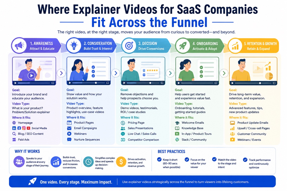
Most SaaS marketing teams commission one explainer video, place it on the homepage, and consider the job done. That leaves enormous value on the table. A single well-produced video, cut into different lengths and versions, can support five distinct stages of the customer journey. Treating video as funnel-wide infrastructure rather than a one-off homepage asset is the highest-leverage shift a SaaS marketing team can make.
1. Awareness
Homepage hero section and organic social. The job here is not to explain every feature, it is to make a visitor understand what category of problem you solve within five seconds, before they decide whether to keep reading.
60 to 90 seconds, animated, problem-first opening, muted autoplay with captions.
2. Consideration
Landing pages, comparison pages, and paid social aimed at prospects actively researching a solution category. This video can go deeper on differentiation because the viewer already knows they have the problem.
60 to 120 seconds, may include real UI footage to prove the claims made in the opening.
3. Decision
Sales decks, demo calls, and pricing pages for prospects close to signing. The video reduces the burden on a sales team to explain the same workflow on every single call and gives buyers something to forward to other stakeholders internally.
Can run longer, 90 seconds to 3 minutes, often screen-recording or hybrid to build trust in product maturity.
4. Onboarding
In-app walkthroughs, welcome emails, and empty-state guidance for new signups. This is the most commonly skipped placement, and often the highest-leverage one, since a confused new user during trial is the most common cause of silent churn.
30 to 60 seconds per feature, short and task-specific rather than one long walkthrough.
5. Retention
Feature announcement videos, in-app release notes, and customer education content for existing accounts. Video here drives adoption of features that would otherwise go unused, which directly supports renewal and expansion revenue.
Under 45 seconds, focused on one feature and one specific outcome for the user.
Notice that only the first two stages, awareness and consideration, are what most SaaS marketing teams think of when they picture "the explainer video." The onboarding and retention stages are frequently owned by a completely different team, customer success or product, and often use no video at all despite having the clearest, most measurable connection to revenue retention. When a studio produces a video as a single homepage asset instead of a funnel-wide system, that gap is exactly where the value gets left behind.
The reason this gap persists is organisational, not strategic. Marketing owns the homepage and the ad budget, so that is where the video gets made. Customer success owns onboarding, but rarely has a video production budget or a relationship with an animation studio, so that stage gets a walkthrough document or a support article instead. The fix is not complicated once it is named: the team commissioning the homepage video should scope two or three short onboarding cuts in the same production round, using the same characters, colour palette, and visual language already approved for the homepage. This keeps brand consistency intact and costs a fraction of commissioning onboarding video as a separate, later project once churn data makes the gap obvious.
A useful test for any SaaS marketing team: list every stage in the table above, and mark which ones currently have a dedicated video. Most teams find they have covered awareness and stopped. The stages left blank are usually the ones with the clearest, most direct line to a metric a CFO already tracks, activation rate, time to first value, and net revenue retention, which makes the case for filling them a budget conversation rather than a creative one.
Video Types for SaaS Compared
Not every SaaS product needs the same production approach. The right format depends on how visual your product actually is, how technical your buyer is, and which funnel stage the video is built for.
| Format | Best For | Strengths | Limitations |
|---|---|---|---|
| Animated 2D explainer | Abstract workflows, backend processes, complex value propositions | Full creative control, works even if the UI is not visually polished, easy to update as the product changes | Does not prove the product exists in its current visual form |
| Screen-recording demo | Product-led growth, visually strong UI, technical buyers who want proof | Builds trust through authenticity, cheap to refresh as UI updates | Boring interface or cluttered UI shows on screen exactly as it is |
| Hybrid (animated + screen capture) | Mid-market SaaS balancing storytelling with proof | Opens with a compelling problem-first narrative, closes with real product proof | More complex production, longer script and storyboard phase |
| Character-driven / motion graphics | Brands wanting distinct visual identity separate from competitors | Highly memorable, differentiates in a crowded category, reusable across campaigns | Longer production timeline, higher creative investment upfront |
Many of the most effective SaaS explainer videos use the hybrid model: an animated cold open that establishes the problem in a way a screen recording cannot, followed by real product footage once the viewer is already invested in the story. This combination is why the storyboard phase for a hybrid SaaS video matters so much. Every transition between animated and live footage has to be planned in advance so the tonal shift does not feel jarring. If you want a deeper look at exactly how that planning document works, see our guide on the explainer video storyboard process.
Character-driven and motion-graphics-heavy approaches sit slightly outside this comparison because their primary job is brand distinctiveness rather than product proof. A category with several visually similar competitors, each using near-identical blue-and-white dashboard screenshots, benefits disproportionately from a video with a recognisable visual identity, a specific character, a distinct colour language, an illustration style unlike anything else in the category, because that identity becomes a recall asset across every future touchpoint the video appears in, not just the one page it was originally built for.
The decision between these four formats should follow the product, not personal preference. A finance or fintech-adjacent SaaS tool moving invisible data between systems has almost nothing worth filming directly, which pushes the format decision toward animation. A design or productivity tool with a genuinely well-crafted interface has the opposite problem: animating around the UI would hide the exact thing that makes the product compelling to watch. The fastest way to make this decision is to ask a single question during the brief: if a first-time viewer watched thirty seconds of your raw product with no narration, would they understand what to do next? If yes, lean toward screen recording or hybrid. If no, lean toward animation.
Ideal Length and Format by Placement
One of the most common mistakes in SaaS video strategy is producing a single 90-second video and publishing the exact same file to every channel. Each placement has a different attention budget, and the video length should respect that.
| Placement | Target Length | Format Notes |
|---|---|---|
| Homepage hero | 60 – 90 seconds | Landscape, muted autoplay with captions, one clear CTA at the end |
| LinkedIn / paid social | 15 – 30 seconds | Square or vertical format, hook in the first 3 seconds, sound-off design |
| Sales deck / demo call | 90 seconds – 3 minutes | Can be longer since the viewer has already opted into the conversation |
| In-app onboarding | 30 – 60 seconds per feature | Task-specific, embedded at the moment the feature becomes relevant |
| Feature announcement | Under 45 seconds | One feature, one outcome, distributed via email and in-app release notes |
| YouTube (organic) | 90 seconds – 2 minutes | Can go longer since YouTube rewards watch time, include a searchable title and description |
Completion rate drops sharply once a video crosses roughly two minutes for top-of-funnel placements, so resist the temptation to cram every feature into one long homepage video. It is far more effective to produce shorter, placement-specific cuts than to force a single video to serve every stage of the funnel at once.
Think of length as a function of how much attention the viewer has already committed, not a fixed creative preference. A cold visitor scrolling LinkedIn has given you zero commitment and will scroll past anything that does not hook them in three seconds, which is why that placement demands the shortest cut. A prospect on a demo call has already committed thirty minutes of their calendar, so a three-minute video in that context is not a risk, it is additional value delivered inside time they have already set aside. Matching length to commitment level, rather than defaulting to one runtime for every channel, is the single easiest adjustment a SaaS marketing team can make to an existing video library without commissioning any new production.
Anatomy of a High-Converting SaaS Explainer Script
The strongest explainer videos for SaaS companies do not open with the product name or a mission statement. They open with the exact feeling a prospect has right before they searched for a solution. "You know that feeling when your team is tracking deals across four different spreadsheets" does more work in five seconds than "Welcome to Acme, the all-in-one sales platform" does in fifteen.
The Hook
The first three to five seconds. Names the exact frustration your buyer types into Google or says out loud to a colleague, before your product is mentioned at all. This is the single highest-leverage line in the entire script.
Opening with the company name or a category statement instead of the problem. Viewers decide whether to keep watching in the first few seconds.
The Problem
Expands on the hook with the cost of not solving it: time lost, revenue missed, errors introduced. This section builds the emotional case for why the viewer should keep watching rather than close the tab.
Spending too long here. Ten to fifteen seconds is enough. The problem section should create urgency, not dwell in it.
The Solution
Introduces the product as the direct answer to the specific problem just described, not as a list of every feature. Show the product doing the one thing that matters most to the viewer watching this specific video.
Feature-dumping. A script that lists eight capabilities in twenty seconds communicates none of them clearly.
The CTA
One clear next step, matched to the funnel stage this specific video serves. A homepage video should not ask for a credit card. An onboarding video should not ask someone to "learn more," they are already inside the product.
A generic "learn more" CTA that does not match what the viewer is actually ready to do at this stage of the journey.
Getting this structure right in the script matters more than the visual style of the final video. A beautifully animated video with a weak hook still loses most of its audience in the first five seconds. If you want a deeper breakdown of writing this structure line by line, our guide on what an explainer video actually is and how it is built covers the foundational structure this section builds on.
A Worked Example
To make this concrete, here is how the four beats play out for a hypothetical project management SaaS tool aimed at agency teams:
- Hook (0 to 4 seconds): "You know that feeling when a client asks for a status update, and you have to check three different tools to answer them."
- Problem (4 to 15 seconds): Visual shows a scattered desktop of spreadsheets, chat threads, and email, with a clock ticking to signal time lost. Voiceover names the cost: missed deadlines, duplicated work, clients who lose confidence.
- Solution (15 to 45 seconds): The scattered tools consolidate into a single animated dashboard. Voiceover walks through one specific workflow, a client update generated automatically from task status, rather than listing every feature the platform has.
- CTA (45 to 55 seconds): A clear, single next step matched to the funnel stage. On a homepage video this might be "Start your free trial." On a sales-deck cut of the same script, it would instead be "Ask your rep for a workspace walkthrough."
Notice that the solution beat does not attempt to show the entire product. It picks the one workflow most relevant to the specific pain named in the hook, and the CTA is written twice, once for each funnel stage this video might serve, rather than as a single generic line reused everywhere.
What the Strongest SaaS Explainer Videos Have in Common
Setting aside format and funnel stage for a moment, the SaaS explainer videos that consistently outperform share a small set of traits regardless of company size, budget, or animation style. These are the patterns worth checking your own video against before it ships.
- They name one specific persona, not "everyone." A script trying to speak to marketers, developers, and finance teams at once ends up speaking clearly to none of them. The strongest scripts are written as if only one job title is watching.
- They show the product doing something, not just describing it. Even fully animated videos benefit from depicting a concrete action, a report generating, a task moving between columns, rather than abstract shapes illustrating a concept in the abstract.
- They resist the urge to justify every feature. A video trying to earn its production budget by cramming in every capability the team is proud of is optimising for the wrong audience. The viewer does not care how much the product does. They care whether it solves their specific problem.
- They are captioned and designed for silent viewing. The best-performing SaaS videos communicate their core message through visuals and on-screen text alone, with voiceover as a layer of additional clarity rather than the only carrier of the message.
- They end with one action, not three. "Start a trial, book a demo, or read the docs" gives a viewer permission to do none of them. One CTA, matched precisely to the funnel stage, converts at a meaningfully higher rate than a menu of options.
None of these traits require a large production budget. They require a script that has been through enough revision rounds to strip out everything that is not essential, which is precisely why the briefing and script-approval process, covered later in this guide, matters as much as the animation itself.
Ready to Build Explainer Videos for Your SaaS Product?
Magic Motion Studio produces animated and hybrid SaaS explainer videos across every funnel stage. Get a scoped quote in 24 hours.
Explainer Videos for SaaS Companies by Growth Stage
What a SaaS explainer video needs to accomplish changes significantly depending on the company's stage. A pre-seed startup and an enterprise SaaS company are not competing for the same attention, are not evaluated by the same buyer, and should not brief a studio the same way.
Pre-Seed / MVP
The video's job is proving the problem is real and the solution is understandable, often before the product is even fully built. Frequently used for Product Hunt launches, investor decks, and early waitlist landing pages.
Speed and clarity over polish. A simple animated explainer that clearly states the problem often outperforms an expensive video that arrives too late for the launch window.
Series A – B Growth
The video's job shifts to differentiation. At this stage there are usually several funded competitors, and the explainer video needs to articulate a specific point of difference rather than a general category pitch.
A funnel-wide system: homepage video, a sales-deck cut, and onboarding videos to reduce the support burden of a fast-growing user base.
Enterprise SaaS
The buyer is a committee, not an individual, and the video often needs to satisfy technical, financial, and executive stakeholders at once. Trust and maturity signals matter as much as the pitch itself.
Higher production value, real product footage to demonstrate maturity, and often multiple stakeholder-specific cuts of the same core story.
A startup weighing its first video investment against a limited budget should read our dedicated guide on startup explainer video production, which covers the speed and resourcing considerations specific to that stage in more depth than this section can.
The transition between stages is where most video libraries fall out of date fastest. A video built to prove a category exists at the pre-seed stage is speaking to a completely different audience than the one a Series B company needs to convince, buyers who are now comparing several funded competitors rather than deciding whether the problem is worth solving at all. Rather than scrapping the original video, most growing SaaS companies are better served by re-scripting the same visual identity and characters around a sharper differentiation message, which is faster and cheaper than starting from a blank page while still keeping brand continuity intact across the company's growth.
| Stage | Primary Video Goal | Typical First Placement | Revisit Trigger |
|---|---|---|---|
| Pre-seed / MVP | Prove the problem and solution are understandable | Landing page, launch platforms, investor deck | Product changes significantly after early user feedback |
| Series A – B | Differentiate against funded competitors | Homepage, sales deck, onboarding flow | New competitor enters the category with a similar pitch |
| Enterprise | Build trust with a multi-stakeholder buying committee | Sales deck, security and procurement materials, case studies | Product matures enough to show real customer logos and outcomes |
Common Mistakes SaaS Teams Make With Explainer Video
Most underperforming explainer videos for SaaS companies fail for one of five recurring reasons. Each one is avoidable once you know to look for it before production begins.
Feature-dumping instead of problem-solving
Trying to mention every capability in a 60-second video results in a script that communicates nothing clearly. Viewers do not remember a list of eight features. They remember one problem being solved well. This mistake usually originates internally: a founder or product lead reviewing the script adds "but we should also mention" notes until the video tries to be a full product tour rather than a persuasive story.
Pick the single feature or outcome most relevant to the funnel stage this video serves, and build the entire script around it. Save the rest for a features page, a knowledge base article, or a longer sales-stage video where a viewer has already opted into more detail.
Opening with the company name instead of the problem
"Welcome to [Product]" wastes the highest-attention seconds of the entire video on information the viewer does not yet care about. By the time the problem is introduced, a meaningful percentage of viewers have already left. This pattern is common because it mirrors how a founder introduces the company in person, but a video has none of the social rapport a live conversation starts with.
Open with the frustration, not the brand. Save the product name for the moment the solution is introduced, once the viewer is already invested in the outcome and ready to hear who is offering it.
Jargon that only makes sense internally
Terms that feel obvious to a founding team, internal product names, category jargon, acronyms, are frequently meaningless to a first-time viewer. A script written by people who live inside the product every day tends to assume knowledge the audience does not have.
Test the script on someone outside the company who has never seen the product. If they cannot explain what it does after watching, the language needs simplifying, not the concept.
No captions, designed for sound-on viewing only
A large share of video is watched muted by default, particularly on LinkedIn and in open office environments where the intended viewer, a busy decision-maker, is most likely to encounter it. A video that only works with sound loses that audience before the message lands. This also affects viewers relying on captions for accessibility reasons, a segment every public-facing SaaS video should be designed to include.
Design the visuals and on-screen text to carry the core message even with sound off. Captions are not optional for any placement outside a sales call, and burned-in captions ensure the message survives regardless of platform or player settings.
Stopping at the homepage and ignoring onboarding
The most common gap in SaaS video strategy is treating the homepage video as the entire program. Meanwhile, the highest-churn moment, the first week of a trial, gets no video support at all, even though it is where confused users quietly disengage.
Extend the same production round to cover two or three short onboarding videos targeting the specific actions that correlate with activation. This is usually the single highest-return addition to an existing video program.
Treating the video as a one-time project instead of a living asset
A SaaS product looks meaningfully different a year after a video is produced, new features, a redesigned interface, a repositioned brand, yet many teams keep running the same footage until it visibly no longer matches the live product. This quietly damages trust with prospects who click through expecting one interface and land on another.
Build videos around abstracted or animated UI representations rather than literal screen capture wherever the format allows it, so the video stays accurate for longer, and schedule an annual review to confirm every claim and visual in the video still matches the current product.
Accessibility and Multi-Market Considerations
Two production details get decided too late in most SaaS video projects, and both are cheaper to plan for upfront than to fix after delivery. The first is accessibility. The second is multi-market accuracy, a real issue for any SaaS company selling into more than one English-speaking market, which describes most companies producing explainer videos for SaaS companies with a US and Australian or UK customer base at once.
Accessibility Is a Production Decision, Not a Post-Production Add-On
Captions solve the muted-viewing problem covered earlier, but accessibility goes further than captions alone. Colour should never be the only signal carrying meaning on screen, a common failure point when a script calls for "red means a problem, green means resolved" without an accompanying icon or label, since colourblind viewers, roughly one in twelve men, will miss that signal entirely. On-screen text needs sufficient contrast against its background, and any information conveyed through voiceover alone should also appear as text for viewers who are deaf or hard of hearing. Building these choices into the storyboard stage costs nothing extra. Retrofitting them after animation is complete usually means redoing entire scenes.
Localization Without a Full Re-Animation
A SaaS company selling into both the United States and Australia faces small but real accuracy problems if a video is produced once and reused everywhere unchanged. Currency symbols shown in any on-screen UI mockup, spelling choices in on-screen text, colour versus color, and date formats displayed inside product screenshots, month-first versus day-first, are all details a viewer in the "wrong" market will notice immediately, and noticing them undermines the polish the rest of the video worked to establish.
The practical fix is a production choice made before animation begins: keep on-screen text, currency, and UI mockups on separate, editable layers rather than baked permanently into rendered footage. A studio that plans for this can swap a currency symbol or a spelling convention for a secondary market without re-animating the scene, producing two accurate regional cuts from a single production budget instead of one video that is slightly wrong everywhere except its primary market.
How to Brief Your Animation Studio on a SaaS Project
The quality of the brief you hand a studio has more influence on the final video than almost any other decision in the process. A vague brief produces a generic video. A specific, funnel-aware brief produces explainer videos for SaaS companies that actually move the metrics you care about.
Name the Funnel Stage
Tell the studio exactly which stage this video serves, awareness, consideration, onboarding, or retention, before any creative work begins. The tone, length, and CTA all depend on this decision.
Provide the Exact Buyer Language
Share the actual words your best customers use to describe their frustration, pulled from sales calls, support tickets, or reviews. This becomes the raw material for the hook, and it is far stronger than internal marketing language. A single well-chosen quote from a support ticket often outperforms a paragraph of positioning written by the marketing team.
Choose the Format Upfront
Decide whether this is a fully animated video, a screen-recording demo, or a hybrid before the script is written. Format affects how the script is structured, especially where live UI footage needs to sync with the narrative.
Approve the Script Before Storyboarding
Every structural decision should be locked at the script stage. Our guide on how to structure and approve an explainer video storyboard covers exactly what happens between script approval and the first frame of animation.
Plan Your Cutdowns in Advance
If you need a LinkedIn cut, an onboarding version, and a homepage version, say so before production starts. Planning cutdowns during the original animation phase is significantly more efficient than re-editing after final delivery.
Confirm the Production Pipeline
Ask what software and process the studio uses. A studio working in a 2D animation or motion graphics pipeline built on a Toon Boom Harmony studio workflow will give you a clearer sense of production timelines and revision capacity than a freelancer working file by file.
The single most valuable thing you can hand a studio before kickoff is not a mood board, it is the funnel stage and the exact language your buyers use to describe their problem. Everything else in the brief follows from those two inputs. To understand what happens once a script is approved, our full explainer video production guide walks through the entire process from brief to final delivery.
Teams briefing a studio for the first time often assume the process starts with visual style. In practice, the strongest SaaS video projects spend more time on the six steps above than on discussing colour palettes, because a technically beautiful video built on a vague brief still fails to convert. A studio that pushes back and asks pointed questions about funnel stage and buyer language before offering a single visual concept is doing the client a favour, even if it feels like a slower start.
Measuring Whether Your SaaS Explainer Video Is Working
A finished video is not the end of the project, it is the start of a measurement window. Explainer videos for SaaS companies should be tracked against the specific funnel stage they serve rather than a single generic metric like total views. A homepage video should be measured against landing page conversion rate. An onboarding video should be measured against activation rate and time to first value. A retention video should be measured against feature adoption among existing accounts.
Vanity metrics like view count tell you almost nothing about whether the video is doing its job. If you are setting up tracking for the first time, our detailed guide on how to measure explainer video ROI covers the exact formulas, platform-specific tracking setup, and benchmarks by business type, including the lead-generation model most relevant to SaaS companies with a demo-request or trial-signup funnel.
One tracking mistake specific to SaaS is worth calling out directly: teams frequently track homepage video engagement but never connect onboarding video views to activation data inside their product analytics tool. Since onboarding and retention are two of the five funnel stages where SaaS explainer videos deliver the clearest return, that blind spot hides some of the highest-value data in the entire program.
A practical setup for most SaaS teams uses three connected pieces. Google Analytics 4 tracks marketing-site engagement and attributes homepage or landing page video plays to downstream trial signups through conversion events. The product analytics tool already tracking feature usage should log onboarding video views as an event alongside activation milestones, so a team can see directly whether users who watched an onboarding video activate at a higher rate than those who skipped it. Finally, the CRM should tag any lead that watched a sales-stage video, so a sales team can see whether deals involving a video close faster than those that do not. None of this requires new tooling for most SaaS companies, only connecting video events to the analytics infrastructure that is typically already in place.
Frequently Asked Questions
SaaS companies need explainer videos because software has no physical form. A prospect cannot hold it, photograph it, or examine it on a shelf, so the product has to be explained rather than shown. According to Wyzowl's 2026 Video Marketing Statistics, 96% of people have watched an explainer video to learn more about a product or service, and 85% say a video convinced them to make a purchase. Explainer videos for SaaS companies compress a complex interface and value proposition into a format a visitor can absorb in under 90 seconds, which shortens the evaluation cycle at every funnel stage from homepage to onboarding.
Most SaaS explainer videos work best between 60 and 90 seconds for homepage and landing page placement, which is long enough to cover the problem, the product, and a clear next step without losing viewer attention. Placement changes the target length: a LinkedIn or social placement performs better under 60 seconds and often under 30, an in-app onboarding video works best between 30 and 60 seconds per feature, and a feature announcement video should stay under 45 seconds. Longer is rarely better once a video crosses the two-minute mark, since completion rate drops sharply after that point.
Animated 2D explainer videos work best for SaaS products with abstract value propositions, multi-step workflows, or backend processes that are hard to show through a literal screen recording. Screen-recording demos work best for product-led growth companies where the interface itself is the selling point and prospects want to see the actual product before signing up. Many SaaS companies use a hybrid approach: an animated opening to establish the problem and value proposition, followed by real UI footage to prove the product works as described.
A single SaaS explainer video should be repurposed across the full funnel rather than treated as a one-time homepage asset. Primary placements include the homepage hero section, pricing and comparison landing pages, LinkedIn and paid social campaigns targeting decision-makers, sales decks and demo calls, in-app onboarding flows for new signups, email nurture sequences for trial users, and YouTube for organic product discovery. Each placement typically needs a different cut length rather than the same full-length video everywhere.
Yes, when the video is placed inside the onboarding and adoption flow rather than only used for top-of-funnel marketing. Users who understand a product's core value quickly are more likely to reach their first meaningful outcome before a trial ends or a subscription renews. Short, feature-specific videos embedded in onboarding checklists and empty states reduce the number of support tickets generated by confused new users and shorten the time to first value, both of which are established drivers of retention in SaaS customer success programs.
Cost depends on animation style, video length, and how many placements or cutdowns are included in the production scope. Rather than quoting a single figure, most studios provide a scoped estimate based on your specific brief, including script rounds, storyboard revisions, voiceover, and delivery formats. You can request a custom quote for your SaaS explainer video project and receive a scoped estimate within 24 hours.
Explainer Video Is Marketing Infrastructure, Not a One-Off Asset
The SaaS companies getting the most out of video are not the ones with the single best homepage explainer. They are the ones treating explainer videos for SaaS companies as infrastructure that runs across the entire customer lifecycle, from the first five seconds of homepage attention through the moment a new user activates a feature for the first time.
That means budgeting for more than one video, briefing a studio with the funnel stage and buyer language up front, matching format to placement instead of publishing one file everywhere, and measuring each video against the specific outcome it was built to influence rather than a single vanity metric. Most guides on this topic publish a list of polished examples and call it a strategy. A list of examples can inspire a visual style, but it cannot tell a marketing team which funnel stage is currently unsupported, what a pre-seed startup should prioritise differently from an enterprise account, or how to connect a video view to an activation metric a leadership team already tracks. That is the gap this guide has tried to close.
Start with an honest audit of your own funnel. Identify which of the five stages, awareness, consideration, decision, onboarding, and retention, currently has no dedicated video, and treat that gap as the next production priority rather than commissioning a second homepage video nobody asked for. A single well-briefed video, produced with the funnel stage and buyer language locked in advance, will consistently outperform a beautifully animated video built without either.
At Magic Motion Studio, every SaaS project starts with the funnel stage and the buyer's exact language, not a mood board. If you are planning your first SaaS explainer video or looking to extend an existing homepage video into a full funnel system, our team can walk you through what that looks like for your specific product before you commit to a scope.
Explainer Videos Built for Every Funnel Stage
Animated and hybrid explainer videos for SaaS companies, from homepage to onboarding. Custom production for brands across Australia and the US.
Related Guides
- What Is 2D Animation? Complete Guide for Businesses
- 2D Animation Studio: Character Animation & Motion Graphics
- Explainer Video Examples That Convert: 12 Real-World Results
- How to Explain a Complex SaaS Product
- SaaS Onboarding vs Explainer Video
- How to Measure Explainer Video ROI
- How to Use Explainer Videos in a Sales Funnel
- Explainer Video Cost in the USA: 2026 Pricing Guide