
Motion Graphics for Social Media: Formats and Best Practices
Effective motion graphics for social media are built to platform specification rather than adapted to it after the fact. That means 9:16 at 1080 by 1920 pixels for Reels, TikTok, and Shorts, with all critical content kept inside the safe zone that platform interface elements do not cover, a visual hook inside the first three seconds, burned-in captions that carry the full message without audio, and a length well under the platform maximum. Six formats do most of the work: kinetic typography, logo stings, animated data, product motion, explainer cutdowns, and seamless loops. Completion rate, not view count, is the metric that tells you whether any of it worked.
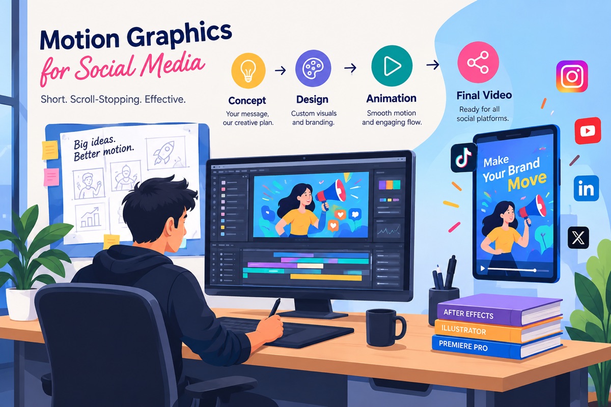
Build to spec, do not adapt to it. Motion graphics for social media should be composed in the target ratio from the storyboard stage, because reframing a finished landscape animation into 9:16 almost always pushes the centre of interest out of frame.
Respect the safe zone. The platform draws its own interface over your video. Anything critical placed in the top, bottom, or right-hand margins will be covered.
Complete in silence, better with sound. The visual track of motion graphics for social media must carry the entire message on its own, with audio adding to a message that is already whole.
Win the first three seconds. Early abandonment is read by the recommendation systems as a quality signal, so a weak opening costs you reach as well as viewers.
Measure completion, not views. View count includes vast numbers of one-second impressions. Completion rate is what tells you whether the work performed.
Most guidance on motion graphics for social media stops at advice that was already obvious: keep it short, design for mute, grab attention early. That advice is correct and almost useless, because it tells you nothing about the decisions that actually determine whether a piece of animated content performs. What resolution do you export at. Where exactly does the TikTok interface cover your frame. How long can a Short actually be before it stops being a Short. Which metric should you look at when the view count looks good but nothing is happening.
This guide answers those questions for motion graphics for social media with current, verified figures, and it flags the places where the commonly repeated numbers are less solid than they appear. If you want the broader definition of the discipline first, the guide on what motion graphics are covers the fundamentals, and the comparison of motion graphics versus animation covers where the two formats diverge.
Why Motion Graphics for Social Media Outperform Static Posts
The argument for motion graphics on social media is not an aesthetic preference. It is a structural advantage rooted in how human visual attention works. The visual system evolved to detect movement in the peripheral field before conscious attention engages, because historically movement signalled either a threat or an opportunity, and both required a response faster than deliberate thought could produce.
A social feed is an environment of almost pure visual competition, and motion graphics for social media are built specifically to win inside it. A viewer moves through dozens of posts in a minute, and the decision to stop is made pre-consciously, before any of the content has been read. Static content has to win that decision through composition and colour alone. Animated content wins it through a mechanism the viewer cannot consciously override.
This is the single strongest reason to invest in motion graphics for social media rather than static graphics: the format has an attention advantage that does not depend on the quality of the idea. A mediocre animation still gets more attention than an equally mediocre static post. A good animation compounds that structural advantage with a good idea, and that is where the disproportionate results come from.
The second advantage: information density per second
Motion allows information to be revealed in sequence rather than presented all at once. A static infographic containing five data points forces the viewer to decide where to look first and in what order, and most viewers abandon the effort. The same five data points delivered as animation arrive in a controlled order, each one given its own moment, with the previous point still visible as context. The viewer does no navigational work at all.
That control over sequence is what makes motion graphics for social media uniquely suited to arguments rather than statements. You can build toward a conclusion, withhold the payoff, and reveal it at the moment of maximum attention. No static format can do this.
2026 Platform Specifications for Social Media Motion Graphics
This is the section most guides to motion graphics for social media skip or get wrong. Specifications change, and a page that quotes a 60 second Shorts limit in 2026 is telling you it has not been reviewed since 2024. The figures below were verified against multiple current sources in September 2026.
| Platform | Ratio | Resolution | Hard Maximum | Optimal Length | File Limit |
|---|---|---|---|---|---|
| Instagram Reels | 9:16 | 1080 × 1920 | 20 minutes | 15 to 30 seconds | 4 GB |
| Instagram Feed | 4:5 or 1:1 | 1080 × 1350 / 1080 × 1080 | Varies by post type | 15 to 60 seconds | 4 GB |
| TikTok | 9:16 | 1080 × 1920 | 10 minutes in-app | 15 to 30 seconds | 287.6 MB |
| YouTube Shorts | 9:16 | 1080 × 1920 | 3 minutes | 30 to 60 seconds | Standard YouTube limits |
| YouTube long-form | 16:9 | 1920 × 1080 | 12 hours | 60 to 180 seconds | 256 GB |
| 1:1 or 4:5 (accepts 9:16 to 16:9) | 1080 × 1080 / 1080 × 1350 | 10 minutes organic | 30 to 90 seconds | 5 GB organic, 500 MB ads | |
| Facebook Feed | 4:5 or 16:9 | 1080 × 1350 / 1920 × 1080 | Varies by placement | 15 to 60 seconds | 4 GB |
Verified September 2026. Platform specifications change without notice, so confirm against the platform's own current help documentation before a major campaign export.

Universal export settings for motion graphics for social media
Across every platform listed above, the same delivery settings apply to motion graphics for social media. Export as MP4 using the H.264 video codec with AAC audio. Use 30 frames per second as the default. Use 60fps only when the content contains fast product or camera motion where the extra smoothness is visible enough to justify the larger file. Avoid 24fps for short-form vertical content: it is a cinematic frame rate that can process inconsistently in Reels and Stories pipelines, and the film-like motion cadence it produces reads as slightly wrong in a feed environment built around 30fps content.
When you upload motion graphics for social media whose aspect ratio does not match the platform's native ratio, the platform preserves the ratio by adding black bars. Those bars are not neutral. They shrink the screen area your content occupies, they signal to an experienced viewer that the content was made for somewhere else and reposted without care, and on vertical platforms they surrender the single biggest advantage vertical video has, which is filling the entire screen.
There is a sharper version of this on YouTube. A video uploaded in anything other than 9:16 does not become a letterboxed Short. It is published as a standard YouTube video instead, which means it never enters the Shorts feed at all and loses the entire distribution mechanism you were targeting.
Safe Zones: Where the Interface Covers Your Frame
This is the most common technical failure in social media motion graphics, and almost no guide addresses it. On vertical platforms, the video fills the screen, but the platform draws its own interface on top of that video. The caption text, the username, the audio attribution, the like, comment, share and follow buttons, the progress bar, and the system status bar all sit over your animation.
Motion graphics for social media are unusually exposed to this, because so much of the format is text. If your headline is centred in the frame, it may be fine. If your call to action sits at the bottom, the caption block will cover it. If your logo sits in the bottom right, the action button column will cover it. You will not see this in your editing software, because the interface only exists on the platform.
Keep all key content here
Working margins for a 1080 by 1920 frame
Treat these as conservative working margins rather than exact platform constants. Reported values differ between sources, and the interface shifts with app versions, device notch sizes, and whether a caption is one line or four.
- Top: keep critical content at least 150 pixels down from the top edge, clear of the system status bar and any platform header.
- Right: allow roughly 150 pixels of clearance from the right edge for the vertical column of action buttons.
- Bottom: allow 340 pixels of clearance from the bottom edge. This is the largest and most variable zone, because caption length changes its height.
- Left: generally usable, but keep a standard margin of around 60 pixels for visual comfort.
This is the same principle as the broadcast safe area convention, where television graphics were kept inside a defined margin because the edges of the frame could be cropped by an unknown display.
Published safe zone figures vary between sources. Some guides report a 120 pixel top margin and a 250 pixel bottom margin, others report 150 and 340. We publish the more conservative figures, because content designed to the larger margin is safe under both, and content designed to the smaller margin is not.
The reliable method is not to trust any published number, including this one. Export a test frame with a grid overlay, post it to a private or scheduled draft, and screenshot it on a real device. That takes ten minutes and settles the question permanently for your specific platform version and device.
The Six Core Formats of Motion Graphics for Social Media
Almost all effective motion graphics for social media fall into one of six formats. Most brands perform better by running two or three of these motion graphics for social media formats consistently than by attempting all six inconsistently, because the repetition is what builds visual recognition in a feed.
Kinetic typography
Text as the primary visual element, animated so that words arrive, emphasise, and exit with deliberate rhythm. It is the most widely produced of all motion graphics for social media formats. This is the highest-leverage format in motion graphics for social media, because it communicates fully without audio by definition, and because it can be produced faster than any character-based animation.
The craft is in the pacing. Amateur kinetic typography reveals text at a constant rate, which reads as mechanical. Effective kinetic typography varies the rhythm, holding on the words that matter and moving quickly through connective phrasing, so the motion mirrors how the line would actually be spoken.
Logo stings and brand idents
A short animated treatment of the brand mark, usually one to three seconds, used to open or close other content. The strategic value is repetition: the same sting appearing at the end of every post trains recognition far faster than a static logo watermark, because motion is remembered better than form.
The discipline here is restraint on length. A sting longer than three seconds at the start of a social post spends the hook window on branding, which is the single most expensive place to put it. Tail stings can run slightly longer, because by then the viewer has already chosen to stay.
Animated data and infographic motion
Charts that build, counters that climb, and comparisons that resolve in sequence. This format converts research, survey results, and internal reporting into content people actually share, which makes it one of the few genuinely organic reach formats available to B2B brands.
The rule that separates good from bad here is one figure per beat. A chart that animates four series simultaneously is a static chart with extra steps. A chart that introduces one series, lets it land, then introduces the next against it, is an argument the viewer follows without effort.
Product and interface motion
Animated representations of a software interface, showing a workflow completing rather than simply displaying screens. This consistently outperforms raw screen recording, because an animated interface can omit irrelevant navigation, slow down the moment that matters, and emphasise the point of value delivery in ways a literal capture cannot without looking manipulated.
For social specifically, the interface needs to be simplified well past what looks correct on a desktop monitor. Real UI text is illegible at phone size in a feed. Enlarge, strip, and abstract until the workflow reads at a glance.
Explainer cutdowns
Short social assets derived from a longer master animation. This is the most economically efficient approach to motion graphics for social media, because the design system, asset library, and brand treatment are all produced once and then reused across many deliverables.
Cutdowns work when the master is planned for them from the storyboard stage, with self-contained segments that make sense in isolation. They fail when a finished 90 second video is sliced after the fact, producing clips that begin mid-thought. The guide on using explainer video on a landing page covers where the master asset earns its return.
Seamless loops
Animation designed so the final frame matches the first, producing continuous playback with no visible restart. Among motion graphics for social media formats, this is the one most specific to the medium. On platforms that auto-loop short content, this converts a single view into several without the viewer consciously choosing to rewatch, which inflates watch time against a metric the recommendation algorithms weight heavily.
Building a true loop constrains the design: any element that moves must return to its starting position, and any transition must resolve. That constraint tends to produce tighter, more disciplined work than an open-ended timeline does.
Need motion graphics built to platform spec?
Magic Motion Studio produces motion graphics for social media across Australia and the USA, delivered in every ratio your channels need.
The Sound-Off Design System for Motion Graphics for Social Media
Every guide to motion graphics for social media tells you to design for sound off. Very few explain what that actually requires, and most repeat a statistic that deserves more scrutiny than it usually gets.
The claim that 85 percent of social video is watched without sound appears on almost every page about this subject, usually stated as established fact. It originates from a Digiday report published in May 2016, and the underlying data came from individual publishers reporting their own numbers, including LittleThings, Mic, and the agency MEC North America. It was never an official platform-wide measurement from Facebook or anyone else.
The reported range was also wider than the headline suggests. PopSugar's own figure in the same report ranged from 50 to 80 percent. The number is now a decade old and predates the entire vertical short-form era.
The practical conclusion does not change: a large majority of viewers will not hear your audio, so the content must work in silence. But a studio that quotes a 2016 publisher survey as a 2026 platform fact is not reading its own sources, and you should treat the rest of its advice accordingly.
- 1
The visual track must carry the entire message
Test it properly: mute the video and watch it as a stranger would. If any part of the message is missing, the audio is carrying load it should not be carrying. Audio should enhance a message that is already complete, never complete a message that is otherwise partial.
- 2
Type sized for a phone in a hand, not a monitor on a desk
Design at 1080 by 1920 but review at actual phone scale before approving anything. Body text that reads comfortably on a 27 inch display can be genuinely illegible on a phone held at arm's length in daylight. When in doubt, go larger and cut words rather than shrinking type to fit them all in.
- 3
Contrast that survives a bright environment
Most social viewing happens in uncontrolled lighting. Light grey text on a white background may pass a design review on a calibrated monitor and disappear entirely outdoors. Aim for the contrast ratios defined in the Web Content Accessibility Guidelines as a working floor, not a ceiling.
- 4
Visual rhythm replaces audio rhythm
In a video with sound, music provides the pacing that keeps a viewer oriented. With sound off, that structure has to be built into the motion itself: consistent beat lengths between reveals, deliberate holds on important frames, and transitions that feel rhythmic rather than arbitrary. Silent content with no visual rhythm feels directionless even when every individual frame is well made.
- 5
Still design the audio properly anyway
The minority who do turn sound on are, by definition, the most engaged segment of your audience. They chose to listen. Rewarding that choice with thin or absent sound design wastes your highest-intent viewers. Build the piece so it is complete in silence and better with sound, rather than treating audio as optional decoration.
Constructing the First Three Seconds of Motion Graphics for Social Media
The opening seconds of a social video decide almost everything that follows, because the recommendation systems on these platforms treat early abandonment as a quality signal. Content that loses viewers in the first moments is distributed less, which means a weak hook does not just cost you the viewers who left. It costs you the viewers you never reached.
Visual interrupt
Something must be moving in the very first frame. A fade from black, a title card, or a logo animation spends this window on nothing. Open on the most visually distinctive moment available, even if it is out of narrative order.
Relevance signal
The viewer now needs to know this is for them. A specific subject, audience, or problem stated in on-screen text does this faster than any visual metaphor. Specificity beats cleverness every time in this window.
Promise of payoff
Establish that something worth staying for is coming. An open question, a partial reveal, or a visible progression toward a result all work. The viewer needs a reason to invest the next ten seconds.
The most common structural error in motion graphics for social media is treating a social asset like a broadcast commercial, which builds slowly toward a brand reveal. Feed content inverts that structure entirely. The most interesting moment goes first, and the brand arrives once attention has already been earned.
Captions and Accessibility in Motion Graphics for Social Media
Captions are treated as a performance tactic in most discussions of motion graphics for social media, and that framing undersells them. They are also an accessibility requirement, and framing them only as a reach optimisation misses the point: viewers who are deaf or hard of hearing cannot access uncaptioned audio content at all, regardless of how good the animation is.
Burned-in captions versus platform auto-captions
Platform auto-captions are generated by speech recognition and toggled by the viewer. They cost nothing, but you control neither their accuracy nor their appearance, they frequently mishandle product names and technical vocabulary, they are positioned wherever the platform decides, and they disappear the moment the video is downloaded, reposted, or embedded elsewhere.
Burned-in captions are rendered into the motion graphics for social media asset itself as part of the animation. You control the typeface, size, colour, contrast, position, and timing completely. They are never toggled off, they survive every repost, and they can be designed as part of the visual system rather than sitting on top of it as an afterthought. For any asset that matters, burn the captions in.
Position them inside the safe zone. Captions burned into the bottom 340 pixels will be covered by the platform's own caption block on vertical platforms. Raise them above that boundary.
Cap each card at two lines. Three or more lines of simultaneous text exceeds what a viewer can read before the next beat arrives, and the entire card gets skipped rather than partially read.
Give text a ground. A solid or semi-opaque backing shape behind caption text keeps it legible over any underlying animation. Text with no backing survives only against deliberately flat areas, and animation rarely stays flat.
Time to speech, not to convenience. Captions that appear before the corresponding audio, or linger well past it, break synchronisation for the viewers using both channels at once.
One Master Asset, Every Platform Ratio
The economics of motion graphics for social media improve dramatically when a single production is planned to deliver multiple platform assets, rather than commissioning separate productions per channel. The design system, illustration library, colour treatment, and animation style are built once. What changes per platform is framing, pacing, and length.
Plan the composition for reframing from the start
The mistake is producing a 16:9 master and then cropping to 9:16, which puts the animation's centre of interest outside the vertical frame in most shots. The working approach is to design in a square or vertical-safe composition where the essential action sits within a central column that survives every crop, and to treat the wider ratios as that column plus additional breathing room on either side.
A realistic delivery set of motion graphics for social media from one production
- 9:16 vertical, 15 to 30 seconds for Reels, TikTok, and Shorts, which is typically the highest-volume asset.
- 1:1 square, 30 to 60 seconds for LinkedIn and Facebook feed placements.
- 4:5 portrait, 30 to 60 seconds for Instagram and Facebook feed, occupying more vertical space than square.
- 16:9 landscape, full length for YouTube, the website, and any presentation or trade context.
- Looping GIF, 2 to 4 seconds for email campaigns, where video autoplay is not reliably supported.
- Still frames pulled from the animation for static posts, presentation decks, and ad creative.
Commissioned as one production with a defined deliverable list, this set of motion graphics for social media costs substantially less than six separate briefs and stays visually consistent across every channel, which is itself a compounding brand advantage. For how this fits a wider content programme, the guide on 2D animation for marketing covers funnel mapping and measurement across channels.
Seven Mistakes That Undermine Motion Graphics for Social Media
These seven failures account for the majority of underperforming motion graphics for social media, and every one of them is a planning error rather than a craft error. None require a better animator to fix. They require a better brief.
1. Uploading one master file to every platform
A single 16:9 export posted everywhere gets letterboxed on vertical platforms, wastes the majority of the available screen, and on YouTube prevents the content entering the Shorts feed entirely.
Fix: specify the full ratio set in the original brief so the exports are produced together, not retrofitted later.
2. Opening with the logo
Branding placed in the first three seconds consumes the single most valuable window in the entire piece and gives the viewer no reason to stay. The viewer does not yet care who made it.
Fix: earn attention first, brand second. Put the identity at the tail, or integrate it into the design system rather than a dedicated opening card.
3. Treating captions as a post-production task
Captions added after the animation is locked end up wherever there happens to be space, which is frequently inside the platform's own interface zone or on top of a moving element.
Fix: block out caption position and size during storyboarding, so the composition is built around the text rather than adjusted to accommodate it.
4. Pacing built for a desktop review, not a feed
Work reviewed repeatedly in an edit suite starts to feel slow to the people making it, and they add time. The viewer seeing it once while scrolling experiences the same cut as far too long.
Fix: review on a phone, once, at full scroll speed, and cut anything that does not survive that test.
5. Using the platform maximum as a target
A 10 minute TikTok is technically permitted and almost never advisable. Maximums define the ceiling of what the system accepts, not the length that performs.
Fix: treat optimal length as the brief and the maximum as an irrelevant technical boundary.
6. Animating every element at once
When everything on screen is moving, nothing is emphasised, and the viewer has no guidance about where to look. Constant motion is visually exhausting and reads as amateur.
Fix: move one thing at a time and let everything else hold still. Stillness is what makes motion legible.
7. Reporting view count as the result
View counts include enormous numbers of sub-second impressions that represent no engagement whatsoever. A post with high views and low completion is a post that was scrolled past efficiently.
Fix: report completion rate and average watch time as the headline metrics, with views as context only.
How to Measure Motion Graphics for Social Media Performance
Setting the success metric before production begins is what separates a motion graphics for social media programme that improves over time from one that simply produces more content at increasing cost. Most teams skip this step entirely. The right metric depends on the platform and on what the asset was made to do, and no single number describes the performance of motion graphics for social media across every channel at once.
| Platform | Primary Metric | Strongest Secondary Signals | Why |
|---|---|---|---|
| TikTok | Completion rate | Shares, rewatches, comments | Completion is the dominant input into further distribution |
| Instagram Reels | Watch time and completion | Saves, shares, profile visits | Saves indicate durable value beyond the first view |
| YouTube Shorts | Viewed vs swiped away ratio | Subscribers gained, likes | The swipe-away ratio is the clearest quality signal available |
| Click-through rate | Comments, reshares, dwell time | Professional intent makes action more meaningful than reach | |
| Paid placements | Cost per completed view | Click-through rate, conversion rate | Ties the creative directly to spend efficiency |
Platform analytics naming changes periodically. Match the definitions above to whatever the current dashboard calls them rather than assuming the label is stable.
One further habit separates teams that improve at motion graphics for social media from teams that simply publish more of it. When a piece performs unusually well or unusually badly, watch the retention graph rather than the headline number. The exact second at which viewers leave tells you what failed, and that is information you can apply to the next brief for motion graphics for social media. A drop at two seconds is a hook problem. A drop at eight seconds is a pacing or payoff problem. A flat curve with low overall views is a distribution problem, not a creative one.
For studios and in-house teams planning a longer programme of motion graphics for social media, the motion graphics services page covers how a multi-asset production is scoped and delivered. If you are still deciding between animation approaches for the programme, the comparison of 2D animation versus motion graphics covers where each format is the stronger choice, and the 2D animation studio page covers character-led work where motion graphics alone is not enough. For longer-form assets that social cutdowns are derived from, the explainer video production page covers the master production process.
Bringing It Together
The difference between motion graphics for social media that perform and work that merely looks good comes down to decisions made before a single frame is animated. The ratio is chosen, the safe zone is blocked out, the caption position is fixed, and the hook is written, all at the storyboard stage. Work produced that way needs no rescuing in the edit.
The reverse is also reliably true. A beautifully crafted animation that was composed for a landscape frame, captioned as an afterthought, and cropped to vertical on delivery will underperform a simpler piece that was built correctly from the outset. Craft matters, but in this format it is downstream of specification.
If you take one habit from this guide, make it the device test. Export a draft, put it on a phone, watch it once at scrolling speed with the sound off, and be honest about whether you would have stopped. That single check catches the majority of the failures described above, and it costs nothing.
Frequently Asked Questions
Use 9:16 vertical at 1080 by 1920 for Instagram Reels, TikTok, and YouTube Shorts. Use 4:5 or 1:1 for Instagram and Facebook feed posts. Use 16:9 for YouTube long-form and X. LinkedIn accepts 9:16 through 16:9, with 1:1 and 4:5 performing best in feed. Match the platform's native ratio rather than uploading one master everywhere, because a mismatched ratio gets letterboxed with black bars that shrink your content and reduce engagement.
Shorter than the platform maximum in nearly every case. TikTok and Instagram Reels perform best at 15 to 30 seconds despite permitting 10 and 20 minutes respectively. YouTube Shorts works best at 30 to 60 seconds against a 3 minute limit raised from 60 seconds in October 2024. LinkedIn suits 30 to 90 seconds against a 10 minute organic limit. Completion rate is what the algorithms weight, so a shorter video watched to the end beats a longer one abandoned halfway.
Yes. A large share of social video is watched muted, and the widely quoted 85 percent figure came from a Digiday report in May 2016 based on publisher-reported data rather than official platform measurement. Even at the conservative end of that range, most viewers never hear the audio. Captions are also an accessibility requirement, since viewers who are deaf or hard of hearing cannot access uncaptioned content at all. Burned-in captions give full control of typography, contrast and timing, and they survive reposting, unlike platform auto-captions.
Six formats account for most effective social media motion graphics: kinetic typography for statement content, logo stings for consistent branding, animated data visualisation for research content, product and interface motion for software demonstrations, explainer cutdowns repurposed from a longer master, and seamless loops built so the last frame matches the first. Most brands do better running two or three consistently than attempting all six.
Completion rate and average watch time are the primary metrics on short-form vertical platforms, because those are the signals the recommendation systems weight when deciding on further distribution. Saves and shares are the strongest secondary signals. View count alone is a poor measure, because it counts large numbers of one-second impressions that indicate no real engagement. On LinkedIn and in paid placements, click-through rate becomes the primary metric instead.
Built for every feed you post to
Magic Motion Studio produces motion graphics for social media across Australia and the USA, delivered in every ratio, length, and caption treatment your channels need.
See Our Motion Graphics Work